A few months back I wrote a post about Johnston Modern, Eiichi Kono and typeface modernisation as an inspiration for Monki Gras 2018. I wanted to bring Johnston into the design language for the conference. I had been using this image as a touchstone.
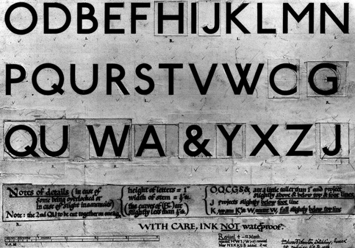
Glorious original design by Johnston. Not however vector graphics, and the theme is about renewing craft to sustain it rather than leaving things in aspic. Which brought me to Railway-Sans, a lovely piece of typographical work by Justin Howes. I will be writing more about Howes, but for now the discovery of the typeface meant we could be playful and hopefully respectful, without infringing London Transport copyright.
So here we are – this logo may change, but we now have the basis of a really nice graphical language for Monki Gras 2018. Great work Jack James – you really smashed it this time. Thanks too, for the splendid technical design support Julien and Nick at Andiamo. You should come along if you are interested in type, culture, tech, design, sustainability of communities, skills, projects, products and services. Tickets available here.

No Comments