My colleague Kate Holterhoff recently wrote a post looking at the use of stock imagery on corporate sites – Don’t Let Imagery Undermine Your Marketing Website
One of the questions posed is about content aimed at developers. Should we cut the use of imagery completely from dev2dev content? This is a good question, as articulated by Michael DeHaan, quoted in this podcast:
Why can’t your webpage have a diagram and a screenshot instead of this, like, picture of a couple of people drinking coffee around a computer, right?
But, argues Holterhoff,
While it may be tempting to express what a product accomplishes in writing alone, monomedia-style approaches fail to account for contemporary consumers’ extreme visual sensibilities. Absent imagery is a missed opportunity to engage consumers. Poorly chosen images may actively undermine a campaign.
If we look at most developer focused websites, certainly of earlier stage companies, they eschew the kind of stock photos we generally see in Corporate Marketing pages. That’s because dev sites are more oriented to the Developer Aesthetic, a loosely held and constantly evolving set of shared ideas about what and how things should look like and be done – think dark mode, or the rise of hexagons in the vernacular of various developer communities, extensive use of purple, even. The in-jokes, the language games and so on. The Aesthetic is something worth considering for people with a holistic view of Developer Experience.
So let’s look at a couple of sites in terms of stock photos vs the Developer Aesthetic.
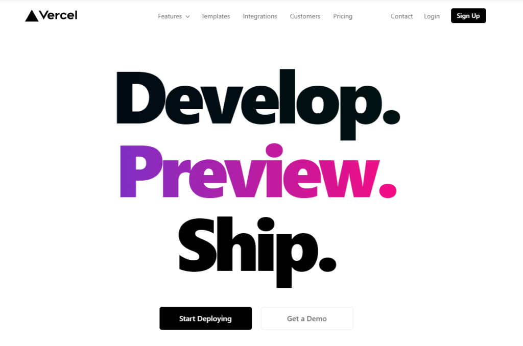
On the face of it Vercel.com for example is all about clean lines, colour palettes and code.
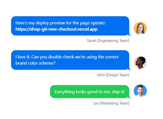
And yet… further down the page are some images that… are arguably a variant on the trusty stock photo, though cleverly used.
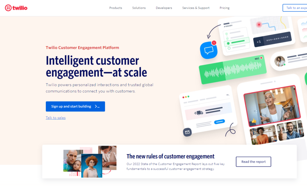
How about Twilio? That’s a code-first company right? These days not so much. The images here are not so far from classic stock, even if presented differently.
Of course Twilio is selling to constituencies other than developers these days, as the homepage makes clear.
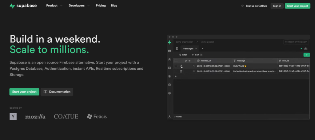
A company like Supabase on the other hand is all about dark mode (definitely Developer Aesthetic) and is pretty stark, with not much imagery.
Supabase does however do something that many other smart community-led sites do. It foregrounds actual users. Not stock, but the authentic voice of the developer.
Gitpod doesn’t use stock, but offers this lovingly created 3d image of a developer’s work environment to push a vibe about developer experience. A hexagon of course – the Developer Aesthetic again.
Gitpod also highlights some well known and highly respected developers further down the page. This is about establishing a kind of emotional, visceral connection.
Which, as Holterhoff argues, is also what stock photos are for in our hypervisual age – they allow marketing to connect with consumers in emotional ways.
Of course there are different kinds of emotions, different expectations from the audience you’re talking to. It totally makes sense for an early stage developer to developer company to be all about the software. Probably dark mode, not much in the way of stock or more traditional approaches.
But as a company wants to engage with a broader range of constituencies, buyers, product influencers and so on, as Holterhood points out, stock imagery or stock imagery tropes are likely to become more and more part of the mix. But that doesn’t generally map directly with the Developer Aesthetic.
If you are going to use stock photos, please make sure to pay for them. The days of easy Flickr searching for Creative Commons images allowing for commercial use are apparently behind us. Let’s make sure the artists are paid, and that you aren’t potentially on the hook for copyright infringement. I have a subscription to Adobe Stock Photos, though I don’t generally choose photos of grinning coffee drinkers, preferring more abstract nature flecked images to trigger emotions.
In sum – there is no hard and fast rule here, but it pays to think very clearly about the audience you’re targeting, and if that audience is developers then engaging with some thought to the Developer Aesthetic is going to pay dividends.
disclosure: Gitpod and Twilio are clients.


Ludovic Leforestier says:
June 17, 2022 at 10:55 am
Glad you picked this theme, stock photos are a pet peeve of mine.
They usually convey no additional meaning, nor do they convey an emotion (good point of yours). Instead they’re there as a filler, a testimony imagination has long left the marketing team.