Donnie Berkholz's Story of Data
Making sense out of information
-

The end of this story
-
React and Polymer arising among JavaScript MV* frameworks
-
Are we nearing peak language fragmentation?
-
RedMonk’s analytical foundations, part 4: 2011–present
-
RedMonk’s analytical foundations, part 3: 2008–2010
-
The breakout of Ansible, and the state of config-management communities
-
The emergence of Spark
-
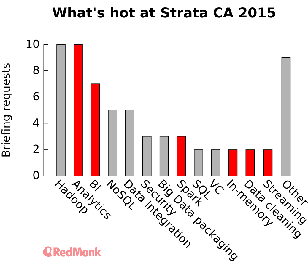
Strata 2015: Reaching for the business user
-
Cloud outages, transparency, and trust
-
Time for sysadmins to learn data science
-
Enterprise tech: the still-hot old thing
-
Docker, Rocket, and bulls in a china shop
Sponsor

Recent Comments