Since our last update of infrastructure as a service pricing trends, adoption of cloud compute continues to grow. A growing number of enterprises across verticals are pursing cloud strategies and taking advantage of cloud services.
However, it can be difficult to properly assess how competitive cloud providers are with one another because their non-standardized packaging makes it effectively impossible to compare services on an equal footing.
To this end we offer the following deconstruction of IaaS cloud pricing models. This analysis is intended not as a literal expression of cost per service; this is not an attempt to estimate the actual component costs for compute, disk, and memory per provider. Such numbers would be speculative and unreliable, as they would rely on non-public information. Instead, this analysis compares base, retail hourly instance costs against the individual service offerings.
What this attempts to highlight is how providers may be differentiating from each other via their pricing models. In other words, it’s an attempt to answer the question for a given hourly cost, who’s offering the most compute, disk or memory?
As with previous iterations, a link to the aggregated dataset is provided, both for fact checking and to enable others to perform their own analyses, expand the scope of surveyed providers or both.
Before we continue, a few notes.
Assumptions
- No special pricing programs (beta, etc.)
- No operating system premium. Prices are based on Linux OS.
- No reserved/committed use instances. Charts are based on virtual machine price/hour costs.
- No specialized packages (i.e. no high memory, compute optimized, etc.)
- Prices are based off the lowest cost US-based region.
Objections & Responses
- “This isn’t an apples to apples comparison.”: This is true. The providers do not make that possible.
- “These are list prices. Many customers don’t pay list prices.”: This is also true. Many customers do, however. But in general, take this for what it’s worth as an evaluation of posted list prices.
- “This does not take bandwidth and other costs into account”: Correct, this analysis is server only. No bandwidth or storage costs are included. Those will be examined separately.
- “Why isn’t price/hour on the y-axis instead of x-axis?” That’s absolutely a valid way to view the relationship between these variables, but in this analysis we’ve made a deliberate choice to frame cost as the independent variable to explore the question from the perspective of ‘given $x, how much disk/memory/compute can I get from each provider?’
- “This survey doesn’t include [provider X]”: The link to the dataset is provided. You are encouraged to fork it.
Notes About Vendors and Processes
- Joyent (dropped in the Q2 2019 iteration): Joyent announced they are ending public cloud services and have been removed from the analysis accordingly.
- Outliers Both AWS and Google offer shapes with 96 cores (via their m5d.24xlarge and n1-standard-96 instances, respectively.) These have been excluded from the analysis, given that in both available resources and price these are approximately 2x larger the next nearest shapes. We will continue to watch the trend of larger instances, but for now this size is an outlier that we’ve excluded.
Notes from previous iterations are available in the footnotes. 1
IaaS Pricing
A quick note on how to read the charts: the simplest explanation is that the steeper the slope, the better the pricing from a user perspective. The more quickly cores, disk, and memory are added relative to cost, the less a user has to pay for a given asset.
With that, here is the chart depicting the cost of disk space relative to the price per hour.
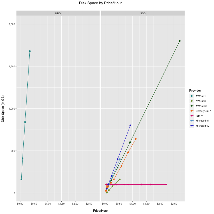
The primary story from this chart is that for most providers, storage is not a primary focus from a differentiation standpoint.
- We previously noted our expectation for providers to converge to SSD storage and this expectation has proved accurate; of the offerings analyzed, only AWS’s m1 legacy instances remain fully HDD. IBM is asterisked because they are in the process of converting data centers to SSD; thus SSD availability is dependent on data center location. Similarly, CenturyLink is noted because their offering is an SDD/SATA hybrid solution.
- IBM’s flat line reflects their maximum offer of 100GB of storage in their base pricing. As their overall price increased for instances with higher compute and memory, there was no corresponding increase in disk space.
- Several providers do not include local storage in their base offering. Google and Alibaba require separate storage in their base pricing and thus are omitted from this chart. Oracle offers 1 PB of remote block storage with their offerings, which we excluded because that is a distinct and separate product line for most providers.
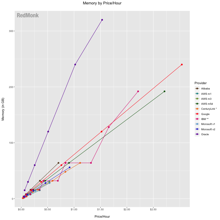
Competition between providers historically has not particularly differentiated in the context of memory per dollar, but Oracle is pricing more aggressively on this front. In offering more memory per dollar across all of their instances, Oracle differentiates their offering from the competition on this metric. The other providers are competitively grouped, with varying rank order amongst the providers across their various instances.
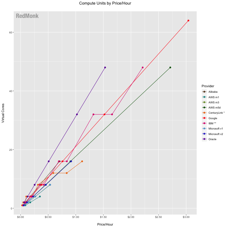
In the cloud, defining precisely what is meant by “CPU’ is complicated by the fact that unlike physical hardware, every cloud instance included here is powered by a virtual compute instance. In years past we attempted to compare available compute units rather than virtual CPUs, or vCPUs. As some providers have moved to stop providing explicit conversions in favor of treating vCPU implementation as a single hardware hyperthread, we have reevaluated the best way to provide an apples-to-apples comparison across providers. Without having direct visibility into a provider’s mix of physical hardware instances and how they map to available instance types, it’d be speculative on our part to try to estimate equivalent compute units. As such, we’ve fallen back on the most basic metric which we have access to, which is why the analysis now compares vCPU.
According to Oracle’s public documentation, 1 of their OCPUs is equivalent to 2 vCPUs and on that basis Oracle remains a pricing leader for compute, offering the highest amount of vCPU compute capacity per dollar spent. Other providers are clustered with no clear competitive standouts. This grouping continues to indicate that fewer providers are choosing to differentiate based on the pricing of their compute units.
IaaS Price History
Besides taking apart the base infrastructure pricing on a component basis, one common area of inquiry is how provider prices have changed over time. It is enormously difficult to capture changes across services on a comparative basis over time, as it’s a delicate balancing act to maintain historic comparability of this analysis while also representing the ever changing offerings of vendors.
When we began tracking infrastructure pricing, available compute shapes commonly topped out at 16 virtual cores; now it’s common to see 32 or 48 vCPU (and sometimes even 96, as noted above). Historically we’ve attempted base the analysis on services that have been offered from the initial snapshot moving forward so as to be as consistent as possible. When the goal is to compare how providers are competing on price, it’s beneficial to control for changes to instance sizes to help isolate trends in price changes. Our pricing trend snapshots thus controls for larger instances, in this case defined as those that are greater than 16 vCPU.
Please keep in mind the objective of this chart: the intent is to understand price changes on a per provider basis over time, and it is less useful to attempt to compare average prices across providers. Services cannot be reasonably compared to one another in this manner because their available packages and the attached pricing vary widely. Some services included more performant, higher cost offerings initially, and others did not.
While this chart is less useful in comparing specific price points between providers as noted above, it is interesting to look at overall trends. Other than slight price reductions at IBM, pricing (when controlled for instance size) remained flat since the last iteration of the analysis.
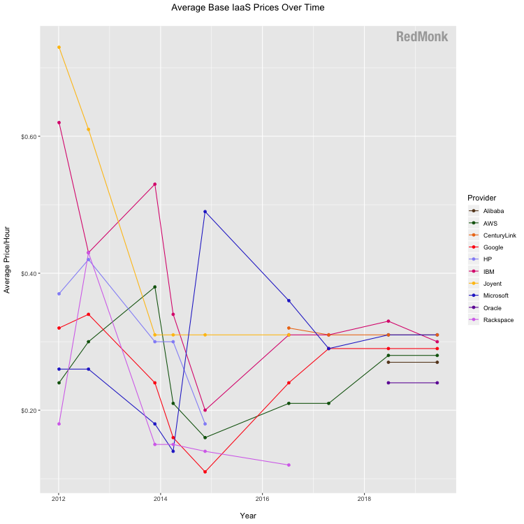
The vendor notes above and in the footnotes 1 provide additional context, but at a high level:
- HP is included through 2014
- DigitalOcean and Rackspace are included through 2016
- CenturyLink was added 2016
- Oracle and Alibaba were added in 2018
- AWS and Microsoft includes new generation instances as of 2018
Correction from 2018: eagle-eyed readers might notice that the 2018 number for Oracle is revised in the above chart. Our last iteration had a typo in calculating their price/OCPU average that has since been corrected.
Implications
The theme of our conclusions remains largely unchanged from the last iteration of our analysis in 2018: convergence. This convergence is evident via several vectors.
- Clustering of offerings: If you look back over the history of this analysis, you’ll notice a distinct shift in the commentary. In early years we spent a fair amount of time parsing the distinct patterns of the charts, as the different providers pursued different pricing strategies. There was a wider variability across the industry in terms of how much of each given resource (disk, compute, memory) was offered for a given price/hour.
In recent years, however, there has been a convergence amongst the industry. The offerings are largely clustered. There are fewer instances where a distinct pricing strategy for a given resource notably differentiates one provider from the others. -
The apparent abatement of downward pricing pressure: The downward pricing pressure again seems tempered; when controlling for instance size, prices have largely leveled out or have even risen slightly. This indicates that while price is still important, it is no longer the primary point of competition.
- The cost of infrastructure: The infrastructure required to run a cloud is capital intensive (as we previously documented). Given that the capital outlay required to compete in the space is a strong barrier to entry, we can expect few new entrants to emerge as competitive disruptors.
When all of these factors are considered together, it’s reasonable to conclude that infrastructure is growing closer to reaching a commodity status. Providers are largely choosing not to compete using price-based differentiation on their base compute offerings. Increasingly competition is focused not on the base compute primitives but rather upon the products and services built on top of them.
Disclosure: Amazon, DigitalOcean, Google, IBM, Microsoft, and Oracle are RedMonk customers. Alibaba, CenturyLink, HP/HPE, Rackspace, and Samsung (Joyent) are not RedMonk customers.
Data: Here is a link to the dataset used in the above analysis.
-
Historic vendor notes:
– Oracle (added as of Q2 2018 iteration): Oracle has simplified its pricing structure to offer true metered instances with no minimum commitments on time or spend and are now included in the analysis.
– Alibaba (added as of Q2 2018 iteration): We added Alibaba after an uptick in interest in our conversations with developers, partners, and cloud customers.
– DigitalOcean (dropped as of Q2 2017 iteration): Droplets were one of the early cloud hosting options, and we originally stretched our definition of ‘apples to apples’ to include DigitalOcean as a reference point in the analysis. However, with the introduction of Amazon Lightsail in Q4 2016 we determined it’s best to begin breaking these VPS services out into a separate analysis rather than lumping them in here.
– Rackspace (dropped as of Q2 2017 iteration): At one time, Rackspace was one of the largest suppliers of hosted and managed infrastructure. Though they were once one of the early arrivers and main competitors in the space, Rackspace now partners with major players like Amazon and Microsoft rather than competing against them directly. Their pivot from supplying cloud infrastructure to supporting it is accelerating with their privatization in Q4 2016. While the company still offers their own hosting services, we determined that their new strategic direction indicates they are no longer a best fit for this IaaS analysis.
– HP (dropped as of Q3 2016 iteration): HP was previously included in this analysis, but was excluded following the announcement that they sunset HP Helion Public Cloud in January 2016.
– CenturyLink (added as of Q3 2016 iteration): CenturyLink’s non-reserved price/hour fluctuates based on the number of hours used. We included their prices based on 720 hours/month as a point of reference. However, given that they don’t have a consistent hourly pricing model, this number should be taken with a considerable grain of salt in terms of its comparative value. ↩ ↩
No Comments