With Amazon’s re:Invent conference a week behind us and any potential price cuts or responses presumably implemented by this point, it’s time to revisit the question of infrastructure as a service pricing. Given what’s at stake in the cloud market, competition amongst providers continues to be fierce, driving costs for customers ever lower in what some observers have negatively characterized as a race to the bottom.
While the downward pricing pressure is welcome, however, it can be difficult to properly assess how competitive individual providers are with one another, all the more so because their non-standardized packaging makes it effectively impossible to compare service to service on an equal footing.
To this end we offer the following deconstruction of IaaS cloud pricing models. As a reminder, this analysis is intended not as a literal expression of cost per service; this is not, in other words, an attempt to estimate the actual component costs for compute, disk, and memory per provider. Such numbers would be speculative and unreliable, relying as they would on non-public information, but also of limited utility for users. Instead, this analysis compares base hourly instance costs against the individual service offerings. What this attempts to highlight is how providers may be differentiating from each other – deliberately or otherwise – by offering more memory per dollar spent, as one example. In other words, it’s an attempt to answer the question: for a given hourly cost, who’s offering the most compute, disk or memory?
As with previous iterations, a link to the aggregated dataset is provided below, both for fact checking and to enable others to perform their own analyses, expand the scope of surveyed providers or both.
Before we continue, a few notes.
Assumptions
- No special pricing programs (beta, etc)
- Linux operating system, no OS premium
- Charts are based on price per hour costs (i.e. no reserved instances)
- Standard packages only considered (i.e. no high memory, etc)
- Where not otherwise specified, the number of virtual cores is assumed to equal to available compute units
Objections & Responses
- “This isn’t an apples to apples comparison“: This is true. The providers do not make that possible.
- “These are list prices – many customers don’t pay list prices“: This is also true. Many customers do, however. But in general, take this for what it’s worth as an evaluation of posted list prices.
- “This does not take bandwidth and other costs into account“: Correct, this analysis is server only – no bandwidth or storage costs are included. Those will be examined in a future update.
- “This survey doesn’t include [provider X]“: The link to the dataset is below. You are encouraged to fork it.
Other Notes
- HP’s 4XL (60 cores) and 8XL (103 cores) instances were omitted from this survey intentionally for being twice as large and better than three times as large, respectively, as the next largest instances. While we can’t compare apples to apples, those instances were considered outliers in this sample. Feel free to add them back and re-run using the dataset below.
- While we’ve had numerous requests to add providers, and will undoubtedly add some in future, the original dataset – with the above exception – has been maintained for the sake of comparison.
How to Read the Charts
- There was some confusion last time concerning the charts and how they should be read. The simplest explanation is that the steeper the slope, the better the pricing from a user perspective. The more quickly cores, disk and memory are added relative to cost, the less a user has to pay for a given asset.
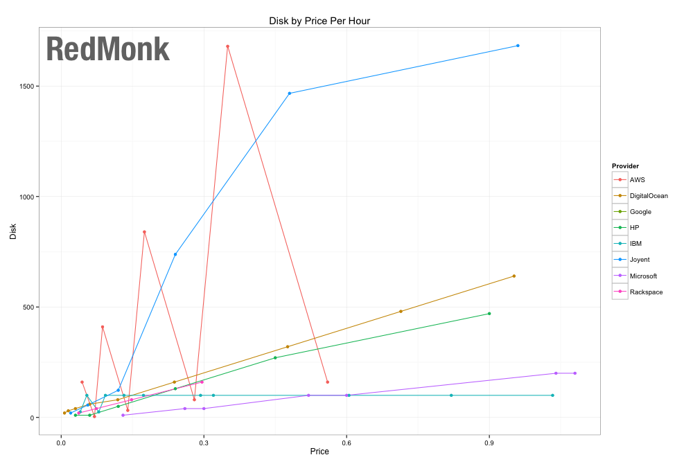
With that, here is the chart depicting the cost of disk space relative to the price per hour.
(click to embiggen)
This chart is notable primarily for two trends: first, the aggressive top line Amazon result and second, the Joyent outperformance. The latter is an understandable pricing decision: given Joyent’s recent market focus on data related workloads and tooling, e.g. the recently open sourced Manta, Joyent’s discounting of storage costs is logical. Amazon’s divergent pattern here can be understood as two separate product lines. The upper points represent traditional disk based storage (m1), which Amazon prices aggressively relative to the market, while the bottom line represents its m3 or SSD based product line, which is more costly – although still less pricy than alternative packages from IBM and Microsoft. Google does not list storage in its base pricing and is thus omitted here.
The above notwithstanding, a look at the storage costs on a per provider basis would indicate that for many if not most providers, storage is not a primary focus, at least from a differentiation standpoint.
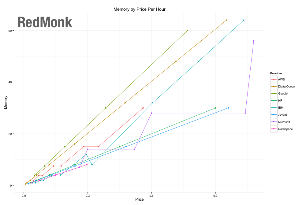
(click to embiggen)
As has historically been the case, the correlation between providers in the context of memory per dollar is high. Google and Digital Ocean are most aggressive with their memory pricing, offering slightly more memory per dollar spent than Amazon. Joyent follows closely after Amazon, and then comes Microsoft, HP and IBM in varying order.
Interestingly, when asked at the Google Cloud Live Platform event whether the company had deliberately turned the dial in favor of cheaper memory pricing for their offerings as a means of differentiation and developer recruitment, the answer was no. According to Google, any specific or distinct improvements on a per category basis – memory, compute, etc – are arbitrary, as the company seeks to lower the overall cost of their offering based on improved efficiencies, economies of scale and so on rather than deliberately targeting areas developers might prioritize in their own application development process.
Whatever their origin, however, developers looking to maximize their memory footprint per dollar spent may be interested in the above as a guide towards separating services from one another.

(click to embiggen)
In terms of computing units per dollar, Google has made progress since the last iteration of this analysis, where it was a bottom third performer. Today, the company enjoys a narrow lead over Amazon, followed closely by HP and Digital Ocean. IBM, Joyent and Microsoft, meanwhile, round out the offerings here.
It is interesting to note the wider distribution within computing units versus memory, as one example. Where there is comparatively minimal separation between providers with regard to memory per dollar, there are relatively substantive deltas between providers in terms of computing power per package. It isn’t clear that this has any material impact on selection or buying preferences at present, but for compute intensive workloads in particular it is at least worth investigating.
IaaS Price History and Implications
Besides taking apart the base infrastructure pricing on a component basis, one common area of inquiry is how provider prices have changed over time. It is enormously difficult to capture changes across services on a comparative basis over time, for many of the reasons mentioned above.
That being said, as many have inquired on the subject, below is a rough depiction of the pricing trends on a provider by provider basis. In addition to the caveats at the top of this piece, it is necessary to note that the below chart attempts to track only services that have been offered from the initial snapshot moving forward so as to be as consistent as possible. Larger instances recently introduced are not included, therefore, and other recent additions such as Amazon’s m3 SSD-backed package are likewise omitted.
Just as importantly, services cannot be reasonably compared to one another here because their available packages and the attached pricing vary widely; some services included more performant, higher cost offerings initially, and others did not. Comparing the average prices of one to another, therefore, is a futile exercise.
The point of the following chart is instead to try and understand price changes on a per provider basis over time. Nothing more, and nothing less.
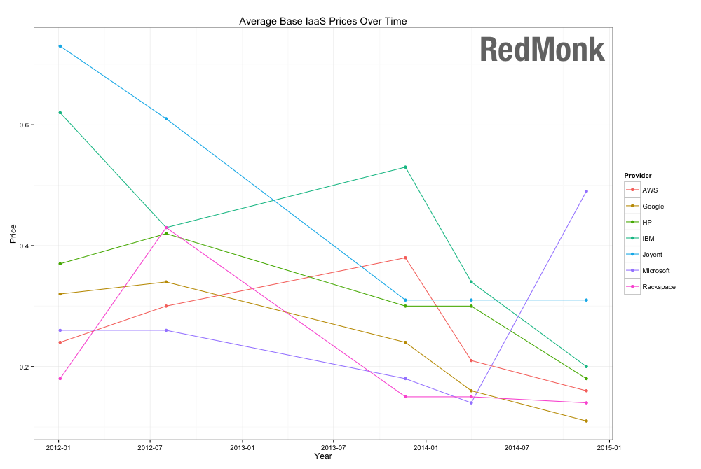
(click to embiggen)
Unsurprisingly, the overall trajectory for nearly all providers is down. And the exception – Microsoft – appears to spike only because its base offerings today are far more robust than their historical equivalents. The average price drop for the base level services included in this survey from the initial 2012 snapshot to today was 95%: what might have cost $0.35 – $0.70 an hour in 2012 is more likely to cost $0.10 – $0.30 today. Which raises many qustions, the most common of which is to what degree the above general trend is sustainable: is this a race to a bottom, or are we nearing a pricing floor?
While we are far from having a definitive answer on the subject, early signs point to the latter. In the week preceding Amazon’s re:Invent, Google announced across the board price cuts to varying services, on top of an October 10% price cut. A week later, the fact that Amazon did not feel compelled to respond was the subject of much conversation.
One interpretation of this lack of urgency is that it’s simply a function of Amazon’s dominant role in the market. And to be sure, Amazon is in its own class from an adoption standpoint. The company’s frantic pace of releases, however – 280 in 2013, on pace for 500 this year – suggests a longer term play. The above charts describe pricing trends in one of the most basic elements of cloud infrastructure: compute. They suggest that at present, Amazon is content to be competitive – but is not intent on being the lowest cost supplier.
By keeping pricing low enough to prevent it from being a real impediment to adoption, while growing its service portfolio at a rapid pace, Amazon is able to get customers in the door with minimal friction and upsell them on services that are both much less price sensitive than base infrastructure as well as being stickier. In other words, instead of a race to the bottom, the points of price differentiation articulated by the above charts may be less relevant over time, as costs approach true commodity levels – a de facto floor – and customer attention begins to turn to time savings (higher end services) over capital savings (low prices) as a means of cost reduction.
If this hypothesis is correct, Amazon’s price per category should fall back towards the middle ground over time. If Amazon keeps pace, however, it may very well be a race to the bottom. Either way, it should show up in the charts here.
Disclosure: Amazon, HP, IBM, Microsoft and Rackspace are RedMonk customers. Digital Ocean, Google and Joyent are not.
Link: Here is a link to the dataset used in the above analysis.
