Cloud adoption continues to grow since our last update of infrastructure as a service pricing trends. However, it remains difficult to properly assess how competitive cloud providers are with one another because their non-standardized packaging makes it effectively impossible to compare services on an equal footing.
To this end we offer the following deconstruction of hyperscalers’ cloud pricing for base on-demand infrastructure. This analysis attempts to highlight how providers may be differentiating from each other via their pricing models. In other words, it’s an attempt to answer the question for a given hourly cost, who’s offering the most compute, disk space or memory?
As with previous iterations, a link to the aggregated dataset is provided, both for fact checking and to enable others to perform their own analyses or expand the scope of surveyed providers.
tl;dr — skip to the analysis, otherwise a few notes before we continue.
Assumptions
- Charts are based on virtual machine price/hour costs.
- No special pricing programs (beta, etc.)
- No operating system premium. Prices are based on Linux OS.
- No reserved/committed use instances or spot instances.
- No specialized packages (e.g. no high memory, compute optimized, networking premiums, custom chips, etc.)
- Prices are based off the lowest cost US-based region
- Data was pulled end of year 2022.
Objections & Responses
- “This isn’t an apples to apples comparison.”: This is true. The providers do not make that possible.
- “These are list prices. Many customers don’t pay list prices.”: This is also true. Many customers do, however. But in general, take this for what it’s worth as an evaluation of posted list prices.
- “This does not take bandwidth and other costs into account.”: Correct, this analysis is server only. No bandwidth or storage costs are included. Those should be examined separately.
- “Why isn’t price/hour on the y-axis instead of x-axis?” That’s absolutely a valid way to view the relationship between these variables, but in this analysis we’ve made a deliberate choice to frame cost as the independent variable to explore the question from the perspective of ‘given $x, how much disk/memory/compute can I get from each provider?’
- “This survey doesn’t include [provider X]”: The link to the dataset is provided. You are encouraged to fork it.
Notes About Vendors and Processes
- Instance Family Updates: We strive to use current and comparable instances that we feel best represents each vendors’ pricing. Because providers frequently update their offerings, this occasionally necessitates expanding the compute instance families used in this analysis. There are new instances included for AWS, Alibaba and Oracle this iteration.
- Outliers: As this analysis has expanded to capture cloud providers’ newer offerings, larger instance shapes have become more common. In the past this analysis considered shapes with more than 48 cores to be outliers, as only a few cloud providers offered them. As of 2021, we include any shape at or below 96 cores. Shapes with more than 96 vCPU will continue to be excluded from the analysis for now.
Notes from previous iterations are available in the footnotes. 1
IaaS Pricing
A quick note on how to read the charts: the simplest explanation is that the steeper the slope, the better the pricing from a user perspective. The more quickly cores, disk, and memory are added relative to cost, the less a user has to pay for a given asset.
Compute
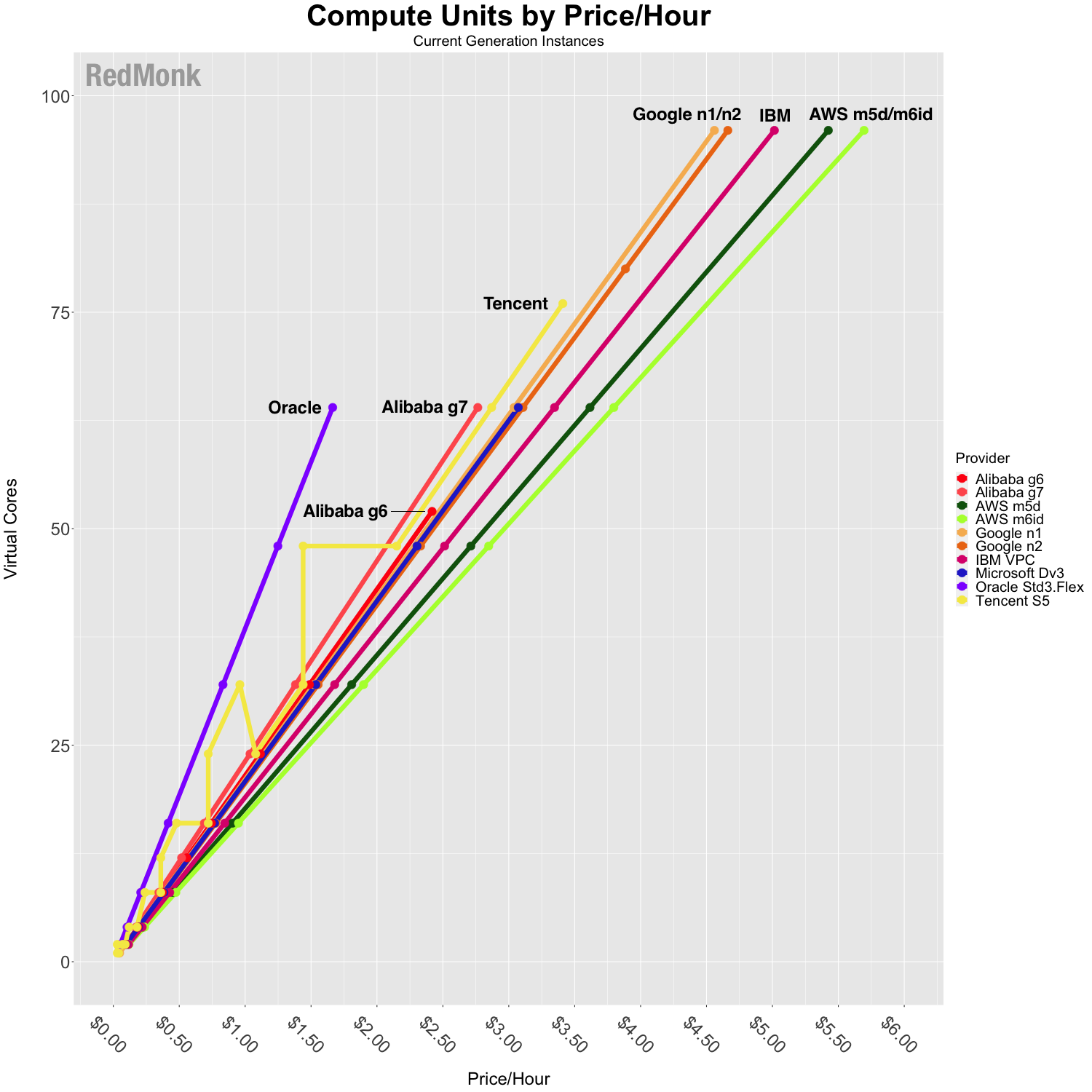
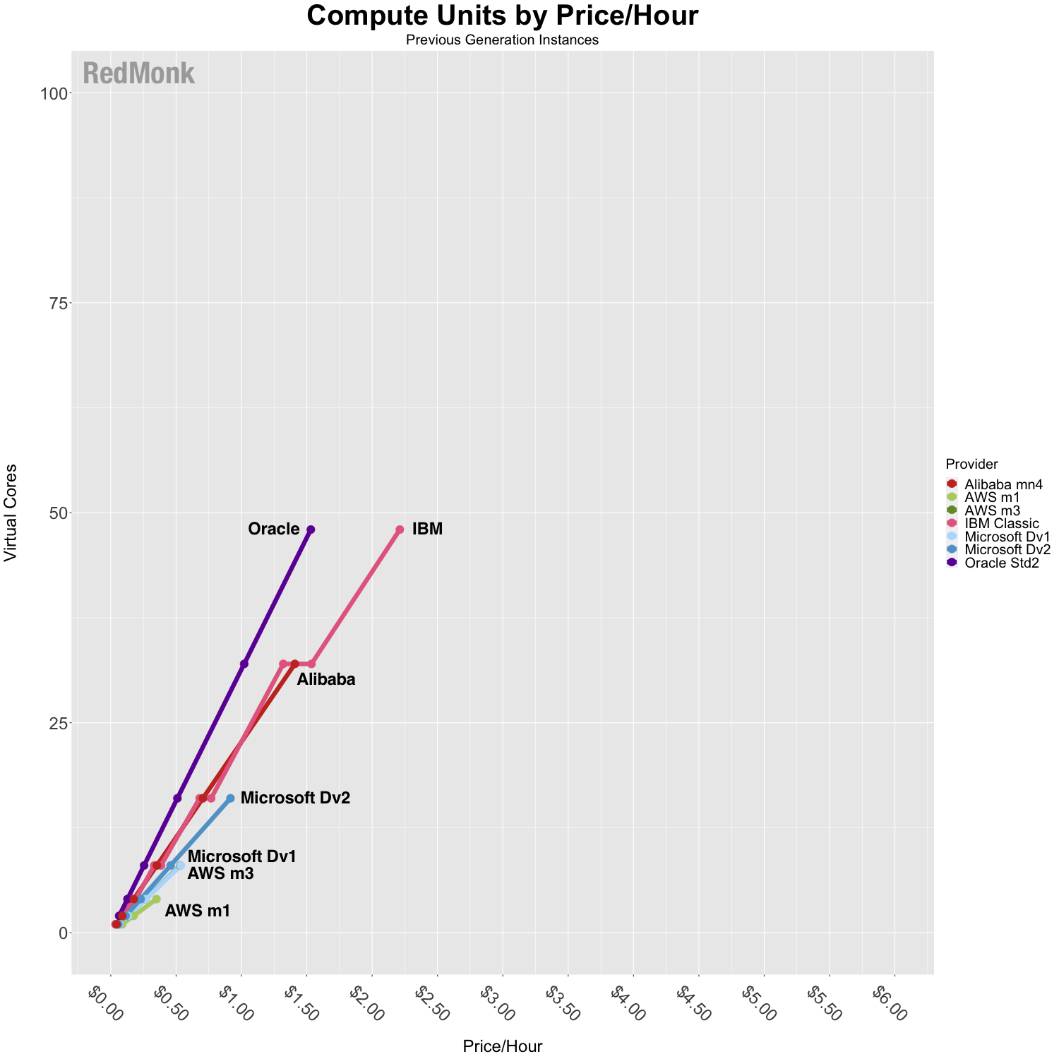
In the cloud, defining precisely what is meant by “CPU” is complicated by the fact that unlike physical hardware, every cloud instance included here is powered by a virtual compute instance. In years past we attempted to compare available compute units rather than virtual CPUs (vCPUs). As some providers have moved to stop providing explicit conversions in favor of treating vCPU implementation as a single hardware hyperthread, we have reevaluated the best way to provide an apples-to-apples comparison across providers. Without having direct visibility into a provider’s mix of physical hardware instances and how they map to available instance types, it’d be speculative on our part to try to estimate equivalent compute units. As such, we’ve fallen back on the most basic metric which we have access to, which is why the analysis now compares vCPU.
Oracle and Alibaba have some of the most competitively priced instances of vCPU compute capacity per dollar spent when contrasted to other providers’ comparable shapes. Other providers are relatively clustered with no clear competitive standouts, indicating that most providers are not choosing to differentiate based on the pricing of their compute units.
As you can see by comparing the maximum capacities in the previous generations chart to current generations, we see a growing trend towards offering shapes with more compute capacity. All of the providers offer shapes with at least 64 vCPU, and four of the providers’ instances now include shapes with more than 100 vCPU.
Disk
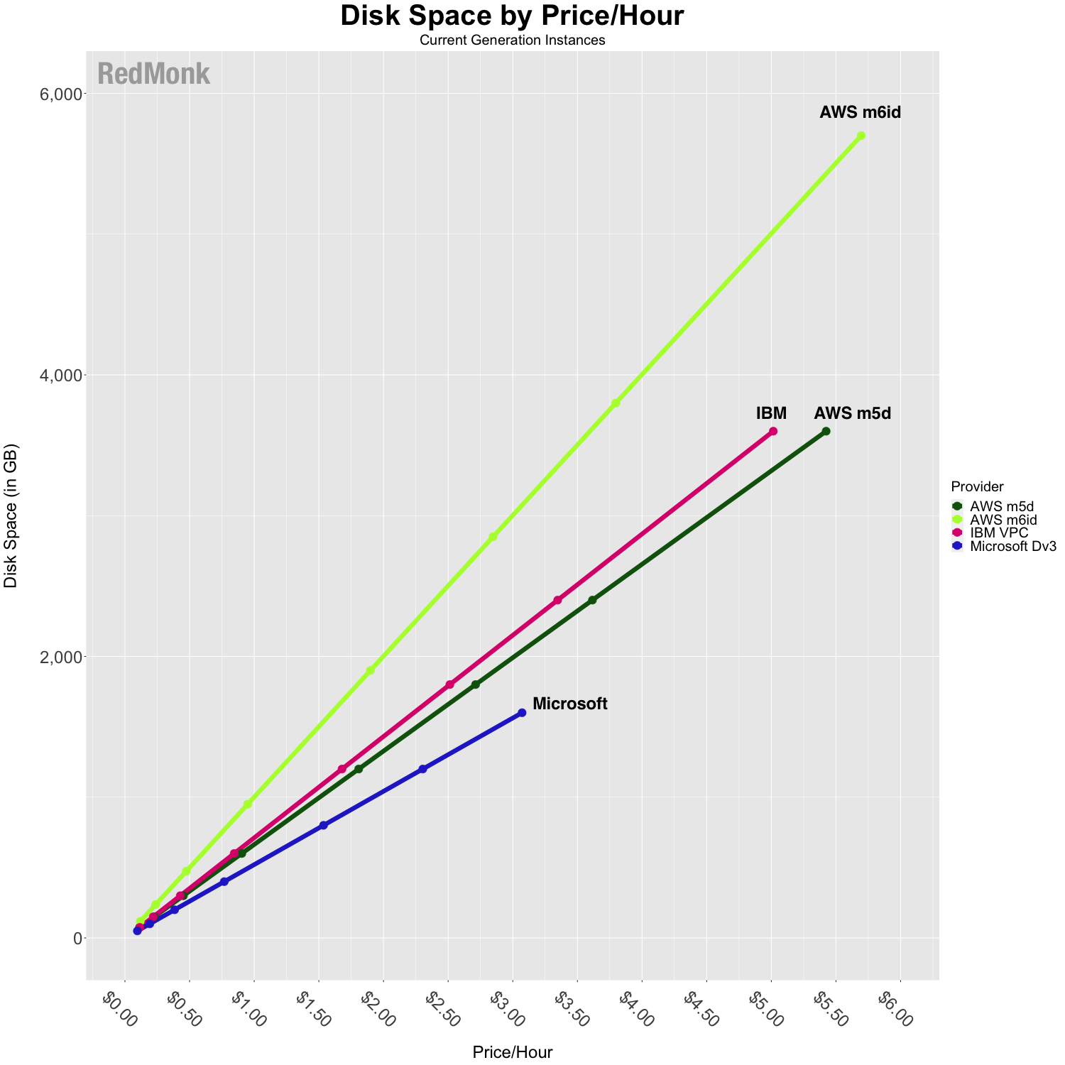
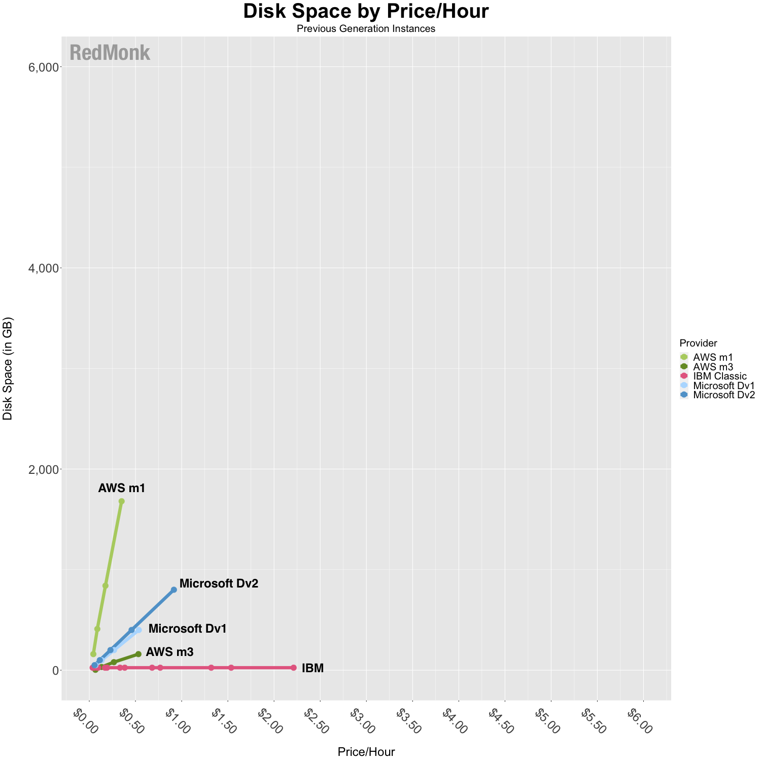
The primary story from this chart is that for most providers, storage is not a primary focus from a differentiation standpoint.
- Several providers do not include local storage in their base offering. Alibaba, Google, Oracle, and Tencent do not include storage in their base pricing and thus are omitted from this chart.
- As with vCPU, we see that capacity limits of available instances have grown with newer generations.
- About the anomalies in the previous generation:
- AWS’ m1 started as an HDD offering.
- IBM Virtual Server for Classic’s flat line reflects their offer for 25GB of SAN storage in their base pricing across all instances, and additional storage must be purchased separately. As their overall price increases for instances with higher compute and memory, there is no corresponding increase in disk space.
Memory
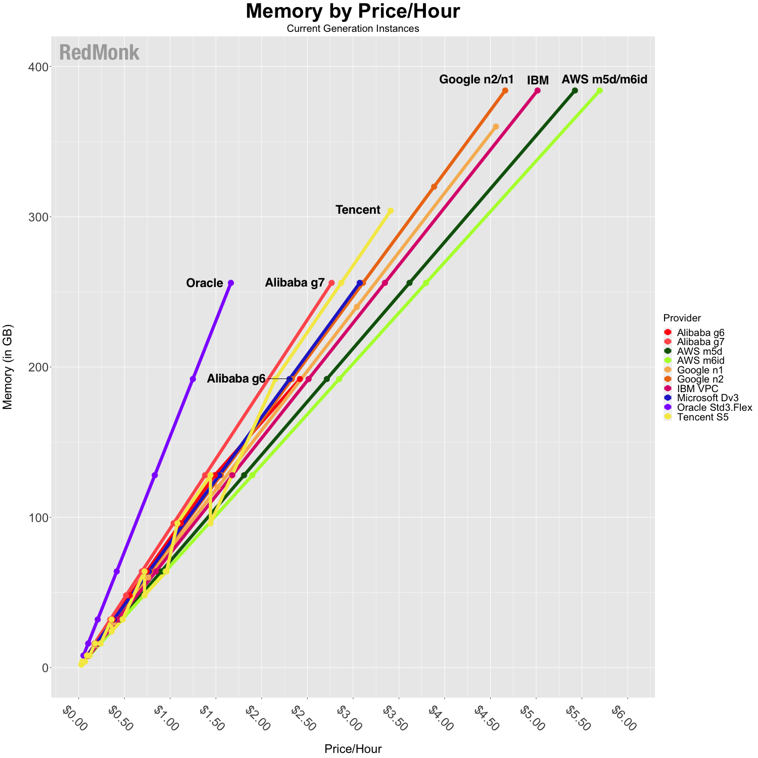
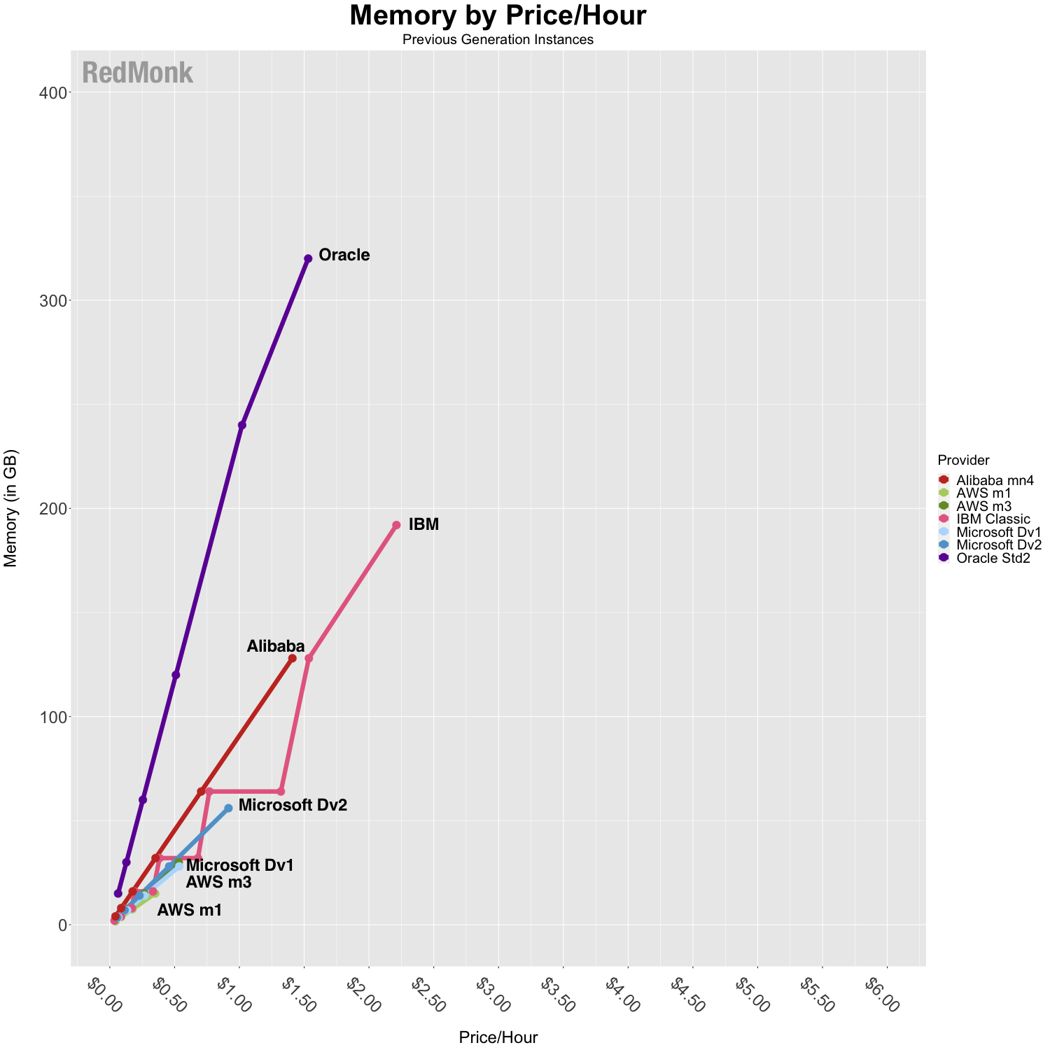
In the context of memory per dollar, competition is not particularly differentiated for most of the providers with the exception of Oracle. Oracle is pricing more aggressively on this front, offering more memory per dollar across all of their instances.
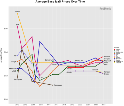
IaaS Price History
Besides taking apart the base infrastructure pricing on a component basis, one common area of inquiry is how provider prices have changed over time. It is enormously difficult to capture changes across services on a comparative basis over time, as it’s a delicate balancing act to maintain historic comparability of this analysis while also representing the vendors’ ever-changing offerings.
When we began tracking infrastructure pricing, available compute shapes commonly topped out at 16 virtual cores; now it’s common to see substantially larger shapes, as noted above. Historically we’ve attempted to base the analysis on services that have been offered from the initial snapshot moving forward so as to be as consistent as possible with the view over time. When the goal is to compare how providers are competing on price, it’s beneficial to control for changes to instance sizes to help isolate trends in price changes. Our pricing trend snapshot thus controls for larger instances, in this case defined as those that are greater than 16 vCPU.
Please keep in mind the objective of this chart: the intent is to understand price changes on a per provider basis over time, and it is less useful to attempt to compare average prices across providers. While this chart is less useful in comparing specific price points between providers as noted above, it is interesting to look at overall trends.
Typically we see providers’ average cost increase with the addition of newer generations. No provider increased their prices on their existing instances; instead this chart reflects the consideration of newer compute options that are more expensive than the prior generation.
However, this trend does not hold true for Oracle. The addition of Oracle’s newer instance family pulled their average price downward rather than up, which is a first for this analysis.

The vendor notes above and in the footnotes 1 provide additional context, but at a high level:
- HP is included through 2014
- Rackspace is included through 2016
- CenturyLink was added 2016 and included through 2019
- Oracle and Alibaba were added in 2018
- AWS and Microsoft include new generation instances as of 2018
- Tencent was added in 2021
- Alibaba, Google, IBM, and Microsoft include new generation instances as of 2021
- AWS, Alibaba, Oracle include new generation instances as of 2022
Implications
The theme of our conclusions for this analysis has remained consistent over the last few years: the nature of competition for cloud providers has changed.
In the early years of this analysis there was a great deal of variability between how each cloud vendor chose to price, and within an individual cloud vendor it was common to see price decreases within existing offerings.
Now the variability in pricing patterns for a given resource (disk, compute, memory) has largely converged across the industry, especially compared to early days of this analysis. There are fewer instances today where a distinct pricing strategy for a given resource notably differentiates one provider from the others.
Furthermore, it is less common to see cloud providers substantially lowering the prices on their existing offerings. When controlling for instance size, prices for standard infrastructure have largely leveled out over the last few years.
Instead, competition has shifted to other parts of the cloud offering.
- Several cloud providers have begun fabricating their own chips in an effort to shift a given workload’s price-performance optimization without directly having to change the price points.
- Wider infrastructure capability, including ARM support, GPUs, and bare metal offerings exist outside of this analysis and are important grounds of competition.
- There is an emerging battle around egress costs, both between direct cloud competitors (like Oracle) and adjacent categories (like Cloudflare). It will be interesting to watch how these aggressive pricing practices will or will not impact some of the larger incumbents’ pricing strategies–AWS in particular.
- The higher level abstractions as well as the unique products and services offered by a cloud provider–rather than the base compute primitives themselves–continue to be points of competition.
The most important takeaway at this point is that standard base infrastructure is reaching a commodity status. While pricing of these instances is still important, it is no longer the primary point of competition for most cloud providers.
Disclosure: AWS, Cloudflare, Google Cloud, IBM, Microsoft, and Oracle are current RedMonk clients. Alibaba, CenturyLink, HP/HPE, Rackspace, Samsung (Joyent), and Tencent are not currently clients.
Data: Here is a link to the dataset used in the above analysis.
-
Historic vendor notes:
– Tencent (added 2021): Tencent’s publicly accessible pricing information and documentation about their US-based service improved substantially such that we are now able to include them in this analysis.
– CenturyLink (dropped in the Q2 2020 iteration): We have numerous conversations about cloud, and in these conversations customers do not include CenturyLink in their evaluations of cloud providers. While CenturyLink continues to have a public cloud offering, for the purposes of this analysis we are no longer including them among top tier cloud service providers.
– Joyent (dropped in the Q2 2019 iteration): Joyent announced they are ending public cloud services and have been removed from the analysis accordingly.
– Oracle (added as of Q2 2018 iteration): Oracle has simplified its pricing structure to offer true metered instances with no minimum commitments on time or spend and are now included in the analysis.
– Alibaba (added as of Q2 2018 iteration): We added Alibaba after an uptick in interest in our conversations with developers, partners, and cloud customers.
– Rackspace (dropped as of Q2 2017 iteration): At one time, Rackspace was one of the largest suppliers of hosted and managed infrastructure. Though they were once one of the early arrivers and main competitors in the space, Rackspace now partners with major players like Amazon and Microsoft rather than competing against them directly. Their pivot from supplying cloud infrastructure to supporting it is accelerating with their privatization in Q4 2016. While the company still offers their own hosting services, we determined that their new strategic direction indicates they are no longer a best fit for this IaaS analysis.
– HP (dropped as of Q3 2016 iteration): HP was previously included in this analysis, but was excluded following the announcement that they sunset HP Helion Public Cloud in January 2016.
– CenturyLink (added as of Q3 2016 iteration): CenturyLink’s non-reserved price/hour fluctuates based on the number of hours used. We included their prices based on 720 hours/month as a point of reference. However, given that they don’t have a consistent hourly pricing model, this number should be taken with a considerable grain of salt in terms of its comparative value. ↩ ↩
No Comments