The prevalence of cloud compute continues to grow since our last update of infrastructure as a service pricing, and the competition among cloud providers remains fierce. However, it can be difficult to properly assess how competitive individual providers are with one another because their non-standardized packaging makes it effectively impossible to compare services on an equal footing.
To this end we offer the following deconstruction of IaaS cloud pricing models. This analysis is intended not as a literal expression of cost per service; this is not an attempt to estimate the actual component costs for compute, disk, and memory per provider. Such numbers would be speculative and unreliable, as they would rely on non-public information. Instead, this analysis compares base, retail hourly instance costs against the individual service offerings.
What this attempts to highlight is how providers may be differentiating from each other via their pricing models. In other words, it’s an attempt to answer the question: for a given hourly cost, who’s offering the most compute, disk or memory?
As with previous iterations, a link to the aggregated dataset is provided below, both for fact checking and to enable others to perform their own analyses, expand the scope of surveyed providers or both.
Before we continue, a few notes.
Assumptions
- No special pricing programs (beta, etc)
- No operating system premium. Prices are based on Linux OS.
- No reserved/committed use instances. Charts are based on virtual machine price/hour costs.
- No specialized packages (i.e. no high memory, etc)
- Where not otherwise specified, the number of virtual cores is assumed to equal to available compute units.
Objections & Responses
- “This isn’t an apples to apples comparison.”: This is true. The providers do not make that possible.
- “These are list prices. Many customers don’t pay list prices.”: This is also true. Many customers do, however. But in general, take this for what it’s worth as an evaluation of posted list prices.
- “This does not take bandwidth and other costs into account”: Correct, this analysis is server only. No bandwidth or storage costs are included. Those will be examined separately.
- “This survey doesn’t include [provider X]”: The link to the dataset is below. You are encouraged to fork it.
Notes About Vendors.
- Joyent (dropped as of Q2 2017 iteration): Joyent was acquired by Samsung in June 2016 and has subsequently stopped publishing their pricing data.
- DigitalOcean (dropped as of Q2 2017 iteration): Droplets were one of the early cloud hosting options, and we originally stretched our definition of ‘apples to apples’ to include DigitalOcean as a reference point in the analysis. However, with the introduction of Amazon Lightsail in Q4 2016 we determined it’s best to begin breaking these VPS services out into a separate analysis rather than lumping them in here.
- Rackspace (dropped as of Q2 2017 iteration): At one time, Rackspace was one of the largest suppliers of hosted and managed infrastructure. Though they were once one of the early arrivers and main competitors in the space, Rackspace now partners with major players like Amazon and Microsoft rather than competing against them directly. Their pivot from supplying cloud infrastructure to supporting it is accelerating with their privatization in Q4 2016. While the company still offers their own hosting services, we determined that their new strategic direction indicates they are no longer a best fit for this IaaS analysis.
- HPE (dropped as of Q3 2016 iteration): HP was previously included in this analysis. HPE has subsequently stopped publishing their Helion price list and the data is no longer available.
- CenturyLink (added as of Q3 2016 iteration): CenturyLink’s non-reserved price/hour fluctuates based on the number of hours used. We included their prices based on 720 hours/month as a point of reference. However, given that they don’t have a consistent hourly pricing model, this number should be taken with a considerable grain of salt in terms of its comparative value.
- Oracle (not included): Oracle now publicizes the prices of their pay-as-you-go compute shapes, but upon closer examination we determined that their offering is most comparable to our forthcoming reserved instances/committed usage analysis as our discussions with the Oracle sales team indicated that their metered service offering is accompanied with the requirement to have a 12-month subscription.
IaaS Pricing
A quick note on how to read the charts: the simplest explanation is that the steeper the slope, the better the pricing from a user perspective. The more quickly cores, disk, and memory are added relative to cost, the less a user has to pay for a given asset.
With that, here is the chart depicting the cost of disk space relative to the price per hour.
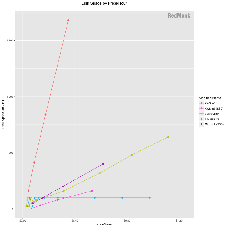
Based on feedback from the last iteration, we broke apart the AWS m1 and m3 products to eliminate the erratic pricing pattern caused by mingling the HDD and SSD products. The AWS m1 line represents traditional disk-based storage, which Amazon prices extremely aggressively relative to the market. Their m1.xlarge instance offers over 5x more GB of disk space per dollar than the next nearest competitor. The m3 points represents the solid state drive product line, which is more costly and offers the lowest disk space per dollar for all but the m3.2xlarge instance.
IBM’s flat line reflects their maximum offer of 100GB of storage in their base pricing. As their overall price increased for instances with higher compute and memory, there was no corresponding increase in disk space.
Google does not list storage in its base pricing and is thus omitted in this chart.
The clustering of storage costs on a per provider basis as well as the intermingling of both SSD and HDD disks indicates that for many if not most providers, storage is not a primary focus from a differentiation standpoint. We do expect all providers to eventually converge to SSD, but for now we thought it would be useful to note the differences in offerings. IBM’s SSD is asterisked based on the fact that they are in the process of converting their data centers to SSD.
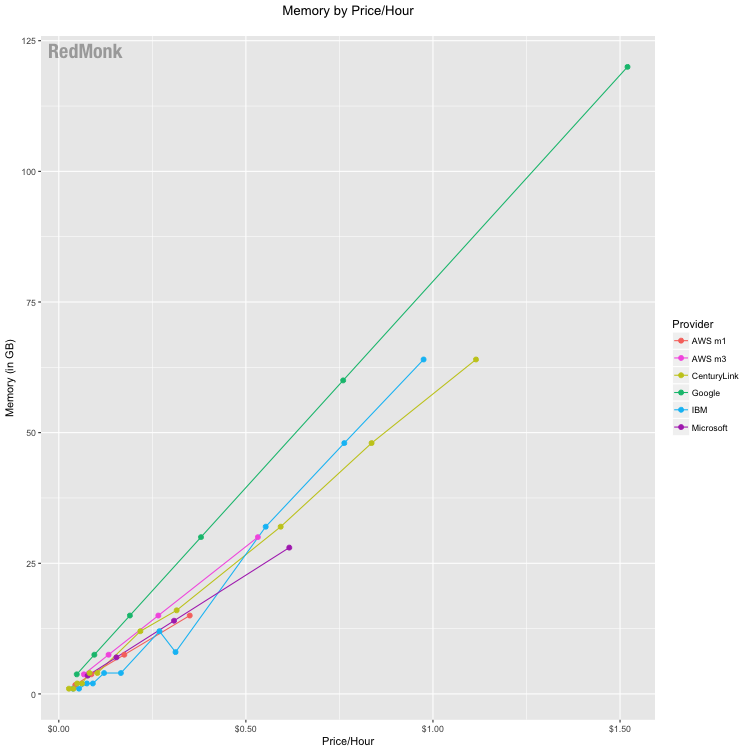
In keeping with historic trends, the competition between providers is not particularly differentiated in the context of memory per dollar. Google remains the most aggressively priced, offering more memory per dollar spent across each of their instances. This instance in particular increases Google’s competitive offerings in memory and compute.
The other providers are competitively grouped, with varying rank order amongst the providers across their various instances.
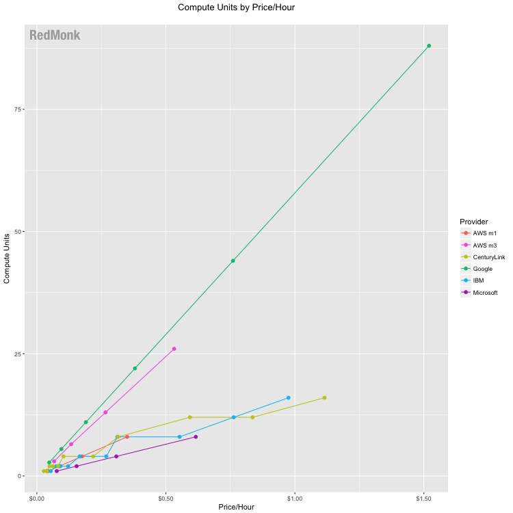
Google again is the pricing leader for compute, offering the highest amount of compute capacity per dollar spent. However, this finding should be taken with a grain of salt as our calculation of compute units is based on the assumption that their previous ratio of vCPU-to-Google Compute Engine Units (GCEU) remains applicable.
In Q4 2016, Google removed GCEU visibility from their pricing. Prior to that, they specified that “2.75 GCEUs represent the minimum power of one virtual CPU.” Given that the current FAQ requires no information on the subject other than instructing users how to calculate the GCPU for their specific instance, we continued to utilize the 1 vCPU = 2.75 GCPUs in this analysis.
AWS’ m3 instances are the closest competitors to Google in terms of compute units/dollar. Other providers are clustered with no clear competitive standouts. This grouping continues to indicate that fewer providers are choosing to differentiate based on the pricing of their compute units.
IaaS Price History
Besides taking apart the base infrastructure pricing on a component basis, one common area of inquiry is how provider prices have changed over time. It is enormously difficult to capture changes across services on a comparative basis over time, for many of the reasons mentioned above.
That being said, below is a rough depiction of the pricing trends on a provider by provider basis. In addition to the caveats at the top of this piece, it is necessary to note that the below chart attempts to track only services that have been offered from the initial snapshot moving forward so as to be as consistent as possible. HP’s history is included through 2014; Joyent, DigitalOcean, and Rackspace are included through 2016. CenturyLink as a new addition is included only in 2016.
Larger instances recently introduced are not included, therefore, and other recent additions such as Google’s n1-standard-32 instance are excluded.
Just as importantly, services cannot be reasonably compared to one another here because their available packages and the attached pricing vary widely; some services included more performant, higher cost offerings initially, and others did not. Comparing the average prices of one to another, therefore, is a futile exercise. The point of the following chart is instead to try and understand price changes on a per provider basis over time.
While this chart is less useful in comparing specific price points between providers as noted above, it is interesting to look at overall trends. A linear regression analysis continues to show downward pricing pressure in the industry. However, the slope of the line is significantly shallower now than a trend line limited to 2012 – 2014. (Note that while these results are impacted by the removal of Rackspace and other providers, the flattening of the line’s slope is also evident when that is taken into consideration.)

Implications
In 2014, Steve questioned whether the downward trajectory of prices was sustainable and speculated that we were likely nearing a pricing floor for base IaaS offerings. From the past two updates, the hypothesis appears to have been accurate. From 2012 – 2014, we saw a trend of downward pricing momentum across the board. Now providers are showing either static or slightly higher prices average price trends. While there is undoubtedly still strong competition in infrastructure pricing, it also appears that the trend of ever downward price pressures seems to be alleviating.
One interpretation of this development is that infrastructure is reaching a commodity status, as this analysis shows increased clustering of many of the providers’ offerings. It will be interesting to observe whether this dynamic continues, particularly as Oracle continues to go to market with price-based messaging. This does not indicate that competition in the IaaS space will not remain fierce, but it does have some implications about the form we can expect competition to take.
Disclosure: Amazon, CenturyLink, Google, IBM, Microsoft and Oracle are RedMonk customers.
Data: Here is a link to the dataset used in the above analysis.
Max says:
May 26, 2017 at 1:29 pm
The charts are a little weird. I would expect to see price per hour on the y axis instead of x axis.
Rachel Stephens says:
May 26, 2017 at 1:43 pm
That is absolutely a valid way to view the relationships between the variables. In this case we made a deliberate choice to frame cost as the independent variable to explore the question from the perspective of “given $x, how much disk/memory/compute can I get from each provider?”