Consumers love product videos. For those in the business of storytelling, video files (GIF, MP4, webM, webP, etc.) are an invaluable tool. Rather than reading a written description of how something kinetic operates, we can see it.
Lightweight, digital, videos provide all the frenetic motion and flashy imagery our goldfish-level attention spans can handle. The easily consumable length of GIFs and sibling file formats makes them fun and accessible additions to any website. They appeal to Boomers, Gen X, Millennials, and Gen Z alike. Although our love affair with the GIF remains strongest, it is an accidental empire. In recent years the webM, webP, and MP4 have begun vying to occupy this space by promising better browser support and smaller file size. Meanwhile Lottie and SVG animations offer improved (faster, crisper) ways to visualize ideas.
Video technologies embedded on websites—no matter how they’re executed—all serve much the same purpose: illustration.
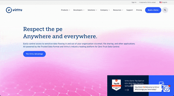
Some videos just look neat, and add polish to your site. Virtru uses a nifty geometric design (a little toodling on the inspector allows me to isolate the webM video here). In conjunction with the CSS/ JS magic of the typewriter functionality in the “Respect the data/people” header (a visual conceit Render also uses), this design looks killer. What does it illustrate? The company’s hipness, modernity, and attention to detail.
Today, marketers in the technology space often rely on videos to demonstrate how a product looks and acts. Unlike a static screen grab or a stock photo (which my colleague James Governor and I have recently written about), videos show functionality and flow. Products with nifty GUIs and slick dashboards benefit particularly from using a demo video in a homepage banner. Who wouldn’t want to add our (exciting) tech to your (tired) stack?
While the value of videos for marketing purposes is unquestionable, and there are very few well maintained sites that don’t incorporate them in some way, these assets must be used carefully.
A few thoughts on how to do so.
3 Best Practices for Tech Website Videos
1) Target the Correct Audience
It’s a classic problem in technology product market segmentation. Business and developer users have different expectations and needs from a product website. Developers often visit a marketing site to access documentation; business users visit to determine fit and price. Both land on the homepage and consume its visuals before proceeding to address their niche concerns.
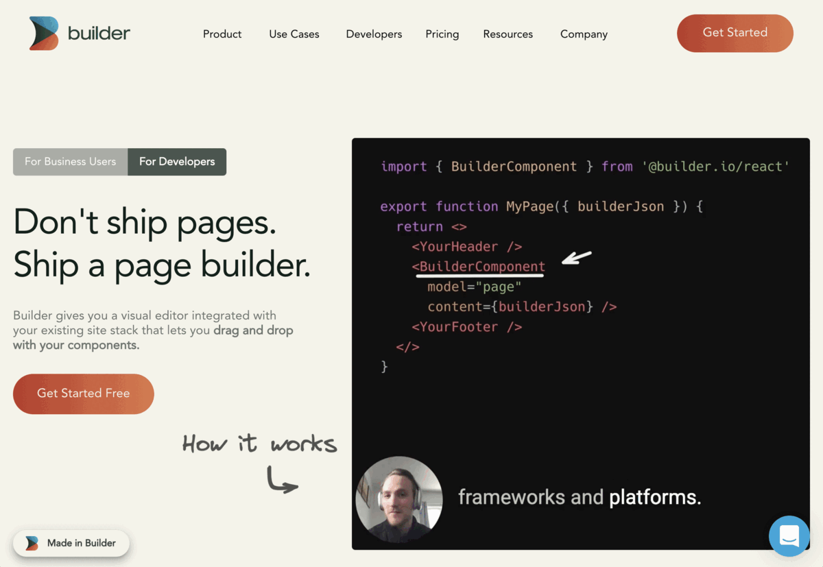
Builder’s homepage features a particularly well-considered approach to this problem. The “For Business Users”/ “For Developers” toggles provide clear paths for these user’s assumed preferred experience. But beyond this considered approach to guiding visitors, Builder also uses two different videos for each visitor. While their business homepage features a flashy MP4 video showing the platform’s drag and drop capabilities to excellent effect, the developer page’s MP4 shows how the technology works using code snippets and the product GUI.
Builder’s two video illustrations dramatize their story well, while also appealing to their main intended visitors. By considering the experience of both dev and business users (although it’s noteworthy that the business experience is default when visiting the site), Builder tailors their homepage experience in a way that communicates their story successfully.
2) Decide What Story Your Visuals Tell
A classic dilemma in selecting visuals is ensuring they contribute to your narrative in an optimal, multimodal way.
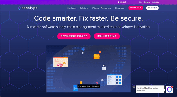
Sonatype’s homepage animation combines audio narration with cute, dancing icons to explain how Sonatype’s supply chain automation management software works. Instead of a technical explanation, this video addresses what problem their product solves and why they are well-positioned to solve it. Sonatype’s friendly pitch becomes all the more friendly owing to the candy-colored packaging of the video.
The best story-telling videos explain what a company does in a concise but illustrative manner (like Sonatype). The best demo videos show a product’s functionality clearly and without friction (like Builder).
3) Invite Devs to the Design Table
Sometimes the flashiest illustration for your product is not the one best fitted to 1) the narrative you wish to communicate, and/or 2) the customer base you hope to reach. This is particularly important when the intended audience is comprised of developers.
At worst, videos can sabotage an otherwise well considered campaign by creating friction for developer audiences. It’s no secret that devs and product folks don’t always see eye-to-eye, and yet all too often marketing and design are the only ones in the room when decisions about the website’s content—written and visual—are being made. Consult devs on your team about your illustration strategy, and particularly the marquee product illustrations on the homepage. They might raise important objections to your proposed imagery, and suggest a better approach for populating this significant real estate.
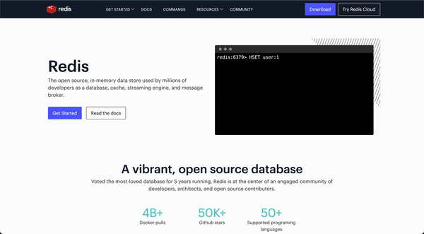
One particularly dev-focused design appears on Redis’s homepage, which opts to include an ersatz black and white command line interface animation. Although it isn’t cute, colorful, or flashy, this visual detail communicates the idea of developer centeredness well. From a practitioner’s perspective, the CLI is clean and easy to understand—an enticing prospect for professionals tasked with staring at similar looking interfaces on a daily basis.
Redis’s visuals are not intended to appeal to marketers and nontechnical users, and that’s okay! When it comes to database selection, it’s engineers that need to be reached. Finally, if I may be permitted to geek out as a connoisseur of all things frontend, it’s worth noting that this animation is built using CSS rather than an embedded video. Kinda cool.
There’s a lot to say on the subject of tech website videos, so I will end with a few closing strategic questions:
- Does your product demo video reveal what sets you apart from competitors?
- How accessible is your video (color contrast, subtitles)?
- What feeling (vibe, mood) does your video evoke?
- Is your video annoying (never use autoplay with audio!!)?
- Does your video cause friction (never force visitors to watch before they can perform some task)?
Disclosure: Redis, Render, Virtru, and Sonatype are RedMonk clients.