First, a bit of background: for almost twenty years, I’ve been a reader of the Boston Globe. In print when it was available across the street from my off campus housing in college, online these days. Mostly for the sports section, it’s true, but as a fan of the city as well as the Red Sox, I’ll consume a lot more of the paper when I have the time. Witness stories like this one which I just bookmarked this morning.
Given that history, then, you might understand why it pains me to use the Globe as my example of how to do mobile wrong. To be honest, I could have picked a dozen or more media properties I care little for to make the point. But it’s precisely because I care about the Globe and its content that their mobile redirection is so irritating, and thus making its way here.
So, the problem. For reasons that are still not clear to me, the Boston Globe and a slew of other sites practice rigid mobile redirection. For a subset of handsets – namely the the more handicapped mobile platforms out there – this is not a bad decision. The pitiful browser on my old LG CU320, for example, would probably catch fire if it had to parse the bloat that is a regular Boston.com page. One of the distinguishing characteristics of the iPhone, however, as just about anyone who’s used one can tell you, is that it is the real internet. Less Flash, ok, but apart from that it’s the real deal. And yet the Boston Globe, in its infinite wisdom, chooses to redirect me not to the stories I want to read, but their (crippled) mobile homepage. Let me show you what I mean.
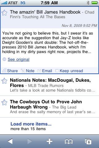
This morning, like any other morning, I picked up my iPhone and began my stroll through the morning’s feeds on Google Reader. Chad Finn, perhaps my favorite of the Globe writers these days, had a new column up. The entry looked like this.

Chad Finn and Bill James? Together in the same post? Doesn’t get any better, I thought, and clicked on the “See original” link. Which should, in a perfect or even mediocre world, take me to that column, AKA the one I want to read and the one that I specifically asked to see. That’s what we in the technology world would call the “Expected result.”
What was the actual result? They redirected me to their poorly designed and rendered mobile homepage, which looked like this.

Where was the Chad Finn column I wanted? Damned if I know; didn’t see it in three clicks and then I gave up looking. Here’s the Home: Sports: Red Sox page. Do you see it in there anywhere? I sure don’t.

But let’s assume that I would be willing to navigate through the additional clicks it would take to track down the story I thought I was being pointed to: what would I get when I was there? A fragmented and disjointed “mobile” version of the content I’m looking for.
For example, take a look at the story segment below. Notice anything odd?

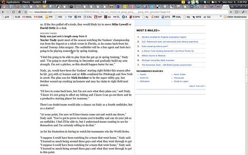
No? Try comparing it against the full version, pictured below.

What’s the difference? About a paragraph, it seems. The mobile version of the story is missing the introduction of the next section, as is often the case. The Globe’s mobile version isn’t just overaggressive in its mobile browser sniffing, then; once you get there, you’re getting only part of the story.
If anyone from the Globe reads this, then, I’d ask you to please, please, PLEASE stop directing capable mobile browsers like the iPhone’s to the mobile site. And if for some unknown reason you can’t do that, please a.) redirect requests to the actual article and b.) make sure that the mobile version is the actual story, rather than a version short the odd paragraph or three.
With the fate of newspapers in general seemingly writing on the wall, I’m aware that everyone has their opinions on how to “fix” things. I do, certainly: it’s all about leveraging usage data. I make no promises here, however, that fixing the mobile experience will cure all the ills that have beset the Boston Globe. All I can guarantee is that fixing the above would make any of its iPhone using customers happier, and that can’t be a bad thing.
