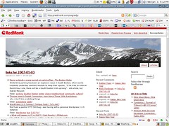
After struggling through theme after theme for weeks in a fruitless search for a skin that was simultaneously attractive, feature-rich, and user friendly, Denver’s best web developer Alex King solved solved more or less all of my problems in less than a day. I answered maybe half a dozen questions yesterday afternoon, and in the words of John Madden, boom – there it was. A design that – IMO, anyway – met all three goals. At the same time.
You won’t have noticed if you just pick up the feed – as most of you probably do – but it’s worth a look. It’s got the usual improvements; improved layout, better fonts, colors that actually go together, and so on – along with some additional plugin wizardry such as Ajax commenting, inline archive/category rendering, etc. But from a RedMonk IT perspective, there are two elemental decisions that make this investment worth every penny.
The Header/Nav Bar
This idea is not original on mine or Alex’s part, having been previously implemented at sites such as Joyent’s Joyeur blog, but I sure as hell didn’t think of it. That’s why you pay designers. With this relatively simple addition, our blogs – once the header is rolled out to my colleagues’ sites – are united in a way they haven’t been before. Indeed, one of the criticisms we receive most frequently regarding the blogs is that they do little for the RedMonk branding. Now, the sites can be tied back RedMonk, while preserving their individuality and uniqueness. And the nav element is easily expandable, should we get crazy and bring on even more analysts.
Componentization/Modularity
Call it what you will, the new design is characterized by a commitment to simple customizability. The nav bar, as an example, lives in the web root and is included at run time. It’s amazing what one simple include can do. Below the nav element, Alex has created a series of standardized RedMonk stylesheets that offer us the ability to preserve some consistency with respect to fonts, hovers and so on and yet select from highly differentiated designs – two column, three column, left column, right column, etc. And then on top of that, we have our own personalized stylesheets, that inherit from the previous two levels but allow for a straightfoward override of parent style elements we as individuals find disagreeable. In short we’ve been handed a single theme that meets at once our corporate and individual needs, all delivered in less than a day. Quite impressive, I’d say.
Remaining To Do’s / Fixes
As Alex pointed out, some of the spacing between entries and tags is tighter than it should be, and that should be repaired shortly. The link to the About page in the upper right hand corner is still a problem – I’ve had some very odd redirect problem there for a while now – but the About link in the sidebar should work. I’m also likely to continue tweaking the header graphic – Alex may even create a plugin for that. And I just noticed that coming in via the vanity domain of tecosystems.org causes problems with the theme, so we’ll have to look at that. Aside from those issues, however, I’m pretty happy. I’ll undoubtedly seek to tweak it here and there over the coming months, but this is unquestionably the best theme I’ve had to date (which is, admittedly, not saying much considering the primitive nature of my previous selections). Anything you’d like to see or see fixed?
Credits
The credit for our new style goes mostly to Alex, of course, but also to Scott Allan Wallick of Plaintxt.org whose Sandbox theme shortcut our development process considerably. This accounts for the Sandbox link at the bottom of every page. Thanks, Scott.
Disclaimers
Alex is not only a developer I have a lot of respect for, but a friend of mine. That said, this work was a paid engagement as opposed to a favor. Also, Joyent, mentioned above, hosts a personal site of mine for free. I think that about covers the disclaimers.
Update
Commenting via the front page Ajax-ified mechanism seems to be another “To Fix” item. If you have a comment to submit, try clicking through to the original entry; that’s working fine near as I can determine. Well, that didn’t take long – quick call w/ Alex and the commenting issue seems to be fixed. Gotta love that customer service.

