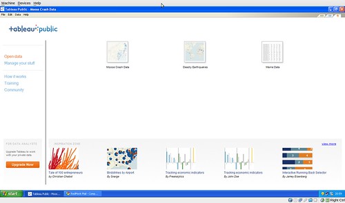
Well, that didn’t take long. One of my 2010 predictions foretold ubiquitous analytics, and here we are not even two months in and that’s already about to happen in the form of Tableau Public.
For those of you unfamiliar with the vendor, Tableau’s a bit of a midpoint product: more statistically and visualization oriented than Excel, more accessible in usage and cost than high end BI alternatives like Business Objects, Cognos or SAS.
Where vendors like Data Applied, GoodData and so on are taking a SaaS approach to analytics and visualization, Tableau is primarily a rich client experience. Sadly for this Ubuntu using analyst, it’s Windows only, but apart from that I have few complaints. As you’d expect from a rich client vendor, there are the standard Desktop and Server product offerings.
And then there’s Tableau Public.
Still in beta, but slated for near term public availability, Tableau Public is essentially a desktop analytics experience coupled to a web back end that handles hosting of the dataset and display of the visualization. Tableau Public is a lot like their standard desktop client, except that you can handle only a hundred thousand rows of data and that you can save only – publicly – to the web. Hence the Tableau Public.
If you’re familiar with IBM’s Many Eyes, Tableau Public is very similar except that it’s got a rich client editor and that the embeddable analytics don’t require a Java enabled browser. Which means that you can share your visualizations even with users of Chromium.
The client you can see above. But what can Tableau Public actually do? A lot more than I can show, I’m sure, in part because I’m new to the whole visualization game, but more because I’ve only been using it for a few days. But note a few things as we run through some examples:
- The displays are rendered via Ajax. No Flash, no Java.
- You can view and/or download the data visualized.
- You can interact with the data in context.
First, a simple cross tab visualization of some Maine population data, which I obtained here.
Maine City, County, Town and State Population Census 
Nothing fancy. Sure, it’s better than the comma separated value file served up by the State of Maine, but otherwise it just looks like a table. Which it is. But try clicking a row, then clicking the funnel icon at the bottom and selecting Keep-Only. The ability to work on data, or download it for offline manipulation, is potentially big.
Next is one that’s hopefully slightly more interesting: a visualization of the moose related crashes from 2006-2008 (that one’s pulled from here).
This one’s significantly more valuable than a CSV datafile, unquestionably, because it’s been married to map data. At the suggestion of my better half, I layered in the streets and highways, so while they’re faint it’s easy to see the (expected) correlation between highway corridors and moose related accidents. You can also use the arrow in the bottom toolbar to pan and zoom, if you’re interested in a higher level of detail.
Last we have a chart you’ve likely seen before, here, which has the sad duty of depicting deaths from the most deadly earthquakes globally through 2008 (data can be found here).
Frequency of Deadly Earthquakes by Location 
The difference between the above and the images I wrote up last time is probably obvious: interactivity. A static image can only tell you so much: the embeds above will not only link you directly to the data I used, but give you the opportunity to ask questions of the visualization. How many have died in the US, for example? Malaysia?
Clearly all of the above are but the most simplistic of visualizations; the NY Times “A Peek into NetFlix Queues,” this is not.
But that’s what’s excellent about public analytics: if you’re so inclined, you can pull down the datasets and better my primitive efforts. Which is how we’ll all learn. I look forward to a world where it’s as easy to share, comment on, and improve analytical visualizations as it is YouTube Video.
And Tableau Public clearly is helping advance that cause.
A few issues, apart from the Windows only nature:
- Tableau can be intimidating to new users. Templates and other “Getting Started” features would help a lot.
- Logging in and posting / retrieving data is a bit cumbersome, because I need to login in for each dataset I’m working off of, rather than once.
- It can be extremely picky with data, and it’s not always obvious which data’s causing the problem. It took me a couple of cycles through to learn that Tableau expects the countryname “Russian Federation” in spite of the fact that the map background says Russia.
- I haven’t seen – yet – the public back end, so it’s not clear how easy it will be to find new visualizations and collaborate with others on improvements.
- If there’s a way to annotate the visualization with notes, thoughts, original sources for the data, I haven’t found it yet.
But overall, it’s a very nice – and very interesting tool: one that I expect we’ll be using quite a bit of around here at RedMonk HQ. I’m heading down the R route as well, but Tableau is significantly more accessible than everyone’s favorite statistics language.
Disclosure: Tableau is not a RedMonk client, but granted me early access to the beta and a trial license for the desktop product.


