Header images from ClickUp’s pitch deck. See “Sequential Art at ClickUp” below.
Recently, I have made the case (in my book, Screaming in the Cloud, and this blog) that visual modes of communication are wildly important for successful storytelling. They are also underutilized by product marketers. In the tech space this is a troubling oversight because schematics, flowcharts, and other visuals do the most toward making sense of difficult information. While the importance of visuals is no secret, they continue to be treated as afterthoughts instead of as foundational components of a thoughtful campaign.
In this post I hope to convince you to adopt visual-first storytelling, if not everywhere, then at least in strategic locations (pitch deck, homepage). To make this case I consider the work accomplished by illustrations, by which I mean any artistically created image intended to supplement writing (historically drawn, painted, or etched, although photography is making inroads), in creating a successful engagement strategy.
Background
Illustrative forms of visual communication and expression stretch far back in human culture to Paleolithic times (the Chauvet Cave paintings, the Venus of Willendorf). Hieroglyphic writing such as the Egyptian and Aztec scripts rely on pictograms rather than the more abstract symbols used in our modern alphabet. Gorgeous patterning and texture makes Arabic and Persian writing illustrative in its own right. Meanwhile, in the West and Asia, illuminated manuscripts during the medieval period beautified texts while at the same time adding depth to the writing they accompanied.
Today, illumination best accords with what we now think of as illustration in the sense of images created to complement writing. Of course, the history I outline above is vastly oversimplified and condensed. It is also somewhat misleading. The notion that graphics accompany writing, and not the other way around, advances the fraught legacy that cedes pride of place to words rather than images. Up to the present day, pictures are often (incorrectly, I think) perceived to be childish, unserious, and noncritical. But what they lack in prestige illustrations make up for in impact.
Illustrations at their best clarify difficult ideas. They are inherently supplementary, and seldom intended to stand alone. Words appear beside, beneath, and sometimes within illustrations in order to better explain the visualized content. This doesn’t mean they show what the words express transparently (an idea critics sometimes characterize as the “window theory” of illustration). Illustrations are often playful and rebellious, pushing against ideas expressed in words instead of passively following them.
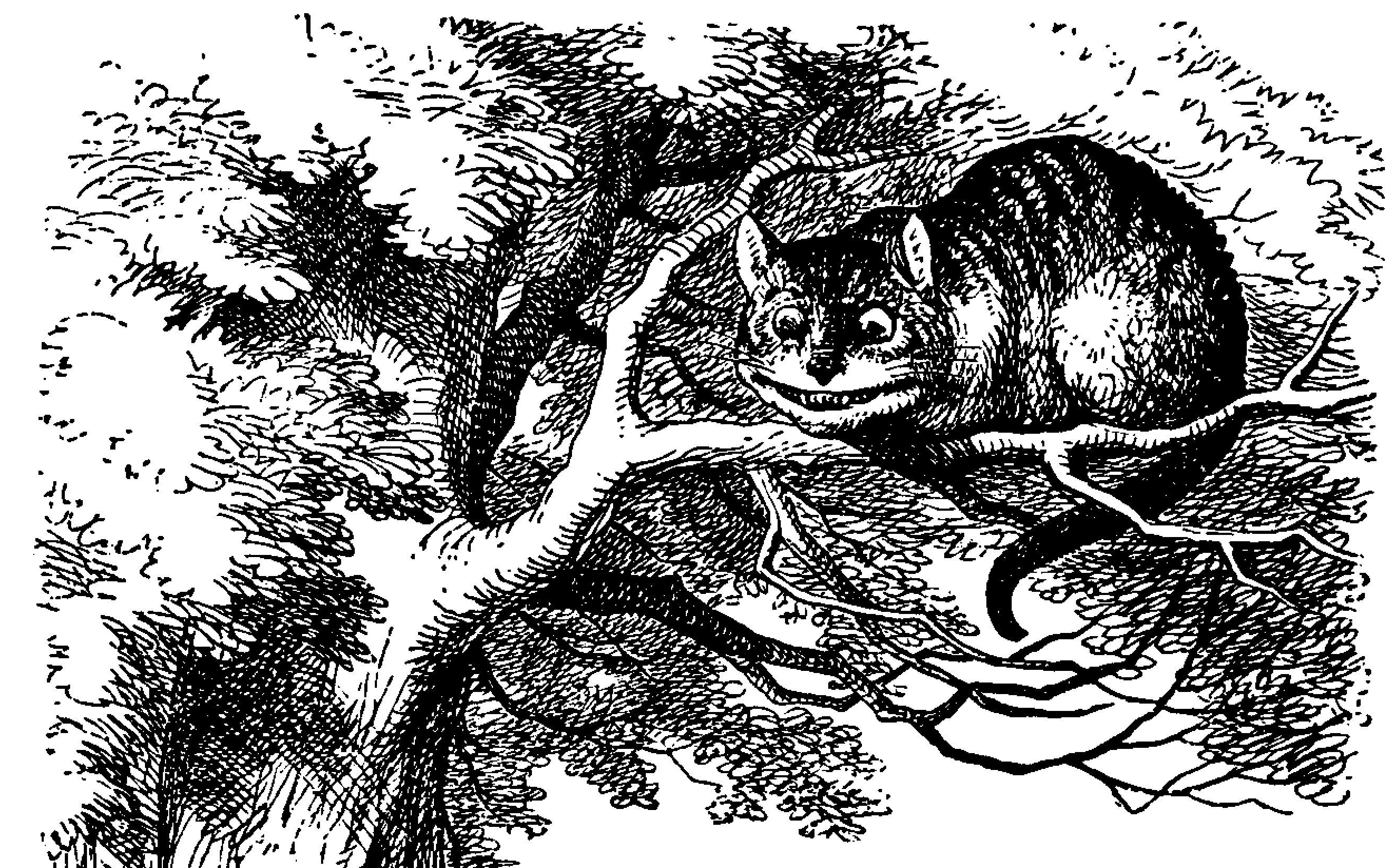
By adding novel detail and context illustrators sometimes do more to solidify ideas into our minds than authors. My favorite example of this is the Cheshire Cat from Lewis Carroll’s Alice’s Adventures in Wonderland. Although Carroll makes no mention of his cat being striped, illustrator John Tenniel’s memorable depictions made the Cheshire Cat’s stripes an essential part of its character. Indeed, contemporary adaptations such as Disney’s several cartoon and live action versions and video games including American McGee’s Alice almost invariably show him striped (although American McGee’s cat’s stripes appear to be diabolical tattoos).
Now that we have the theory of illustrations out of the way, let’s look at some organizations that have made illustrations work for their brand. I will examine two major companies, Salesforce and ClickUp, to demonstrate how each uses pictures to make their brands more distinctive and engaging.
Salesforce’s Characters

Since the introduction of Trailhead, Salesforce’s well-considered cast of characters has become a recognizable and playful addition to this company’s branding. All of Salesforce’s characters (a term their marketing prefers over mascots, creatures, and critters) are intended to represent community groups (devs, admins, etcetera). According to Salesforce’s Character Overview:
Our characters reflect our human side, and differentiate the company from our competitors as a fun brand
Salesforce’s earliest and most popular character, Astro, is a cute, nonbinary Tanuki (a Japanese raccoon dog). They represent “community and inclusion,” and appear on a variety of corporate communications.
Like all of Salesforce’s characters, Astro is intended to “make our messages more relevant and memorable”—and it’s working! As anyone who has ever attended Dreamforce or TrailblazerDX will tell you, Salesforce’s brand loyalty is infectious. According to Amy Regan Moorehouse, Senior Vice President, Global Salesforce Ecosystem Enablement, characters are essential to Trailhead’s success because they add:
A bit of whimsy and fun that really connects learners to their path. It’s the idea that you can start somewhere and you can go where you want to. That’s part of the magic they bring to our learners. And it definitely has spilled over to all of our corporate branding. If you go into any Salesforce office or event, you see all of our characters there.
Compared to the more stark, corporate feel of Salesforce’s 2010 website (see it on the Wayback Machine), the forest themed characters and illustrations that span Salesforce’s current illustrative marketing materials create a unified and unforgettable experience for users.
Sequential Art at ClickUp
Sequential art, most commonly seen in comic strips, positions a series of illustrations close together in order to tell a coherent story. This form of illustration is rare in the tech space so you can imagine my delight when ClickUp briefed RedMonk using a sequence of four illustrations to show, rather than just tell us about their problem statement. Let’s talk about this series (which I made into a gif for this post’s header).

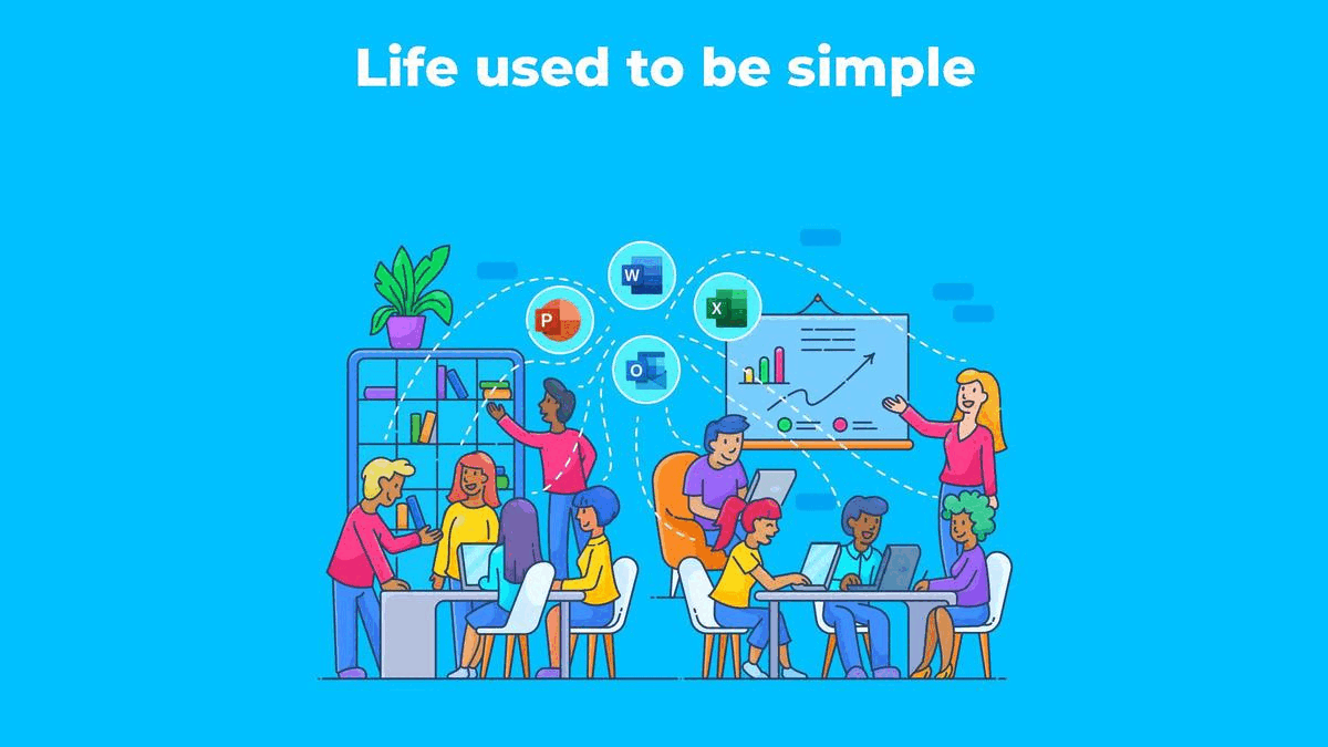
The first shows a diverse group of people smiling and collaborating. The art style is cartoonish, fun, modern, and bright. The IKEA-style chairs and bookshelves give off coffeeshop or maybe university library vibes, but the blonde woman on the right gesturing at a businessy chart suggests this is, in fact, a workplace. Beyond proximity, what connects these individuals is their happiness, engagement and, white dashed lines pointing at the Microsoft Office Suite icons (Power Point, Word, Excel, and Outlook) floating above their heads. By positioning these icons beneath a caption saying “Life used to be simple” ClickUp has made a sly dig at Microsoft’s longevity. But, hey, at least we know things are going well at this company because the chart shows upward growth and everyone appears happy, engaged, and content. However, the caption suggests that these good times will not last.
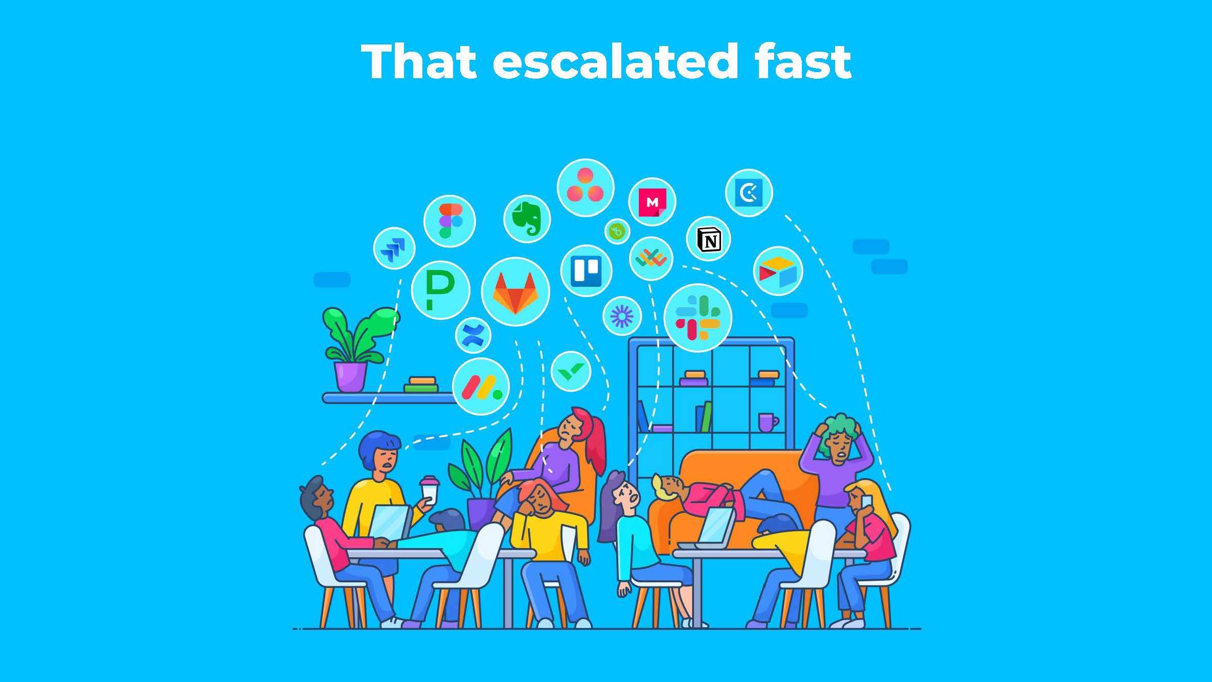
The next slide retains the same color palette, setting, and cast of characters, but it is readily apparent that things are amiss. Yet, the caption “That escalated fast” is vague, so viewers must conjecture about what has happened from the illustration. This is an interesting instance of the text providing the mood, while the image explains the context and details.
The people in this image look frazzled, bored, frowning, sleeping, and disengaged. The chart showing positive growth is gone, and now the space is in disarray with workers’ postures—hunched across the table, reclining in a chair, lying down on the couch, talking on the phone—doing more to convey this attitude than their facial expressions (which are difficult to discern at a glance). The woman on the far right even appears to be pulling out her hair. Once again, the white dotted lines reveal what’s on these individuals’ minds. Instead of the neatly arranged Office Suite icons, this spread of apps and services is visually chaotic. GitLab, Slack, Evernote, Figma, Jira, and other logos appear in variously sized circles with lines stretching limply to connect with them. Although this illustration’s audience may possess brand loyalty for many of these companies, they immediately understand the pain of app-overload that this image communicates. Viewers can place themselves in each character’s shoes and empathize with the confusion this situation can bring.
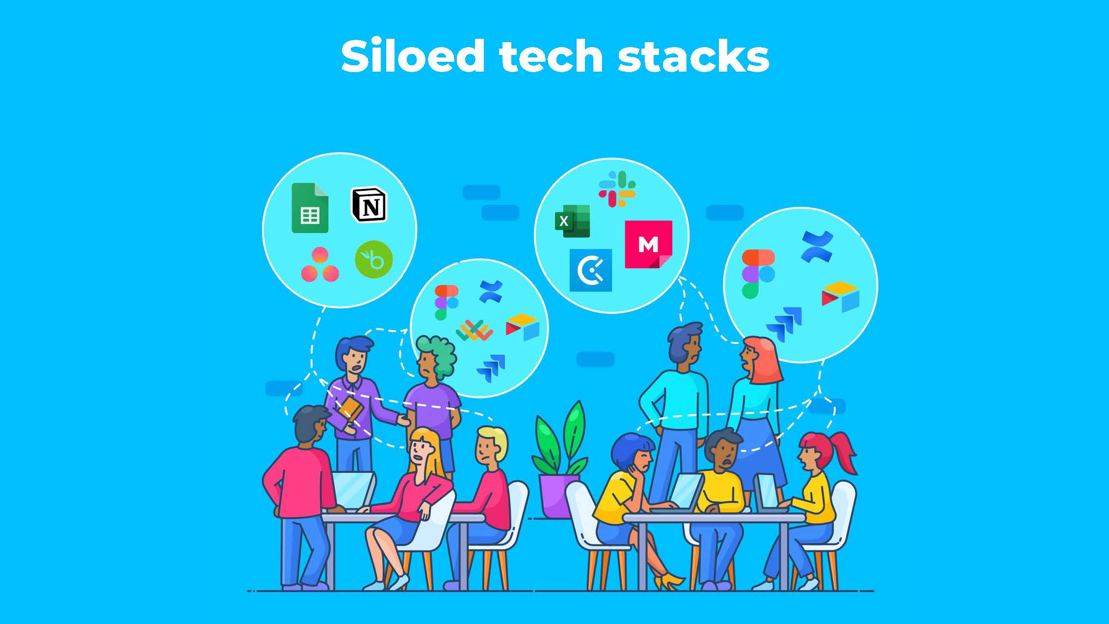
The next image, which is captioned “Siloed tech stacks,” engages the idea of collaboration, and how tooling factors into team relationships. Everyone seems a bit less upset than in the last image based on their posture, but their expressions continue to look unhappy. The most obvious visual change is that people wearing identically colored shirts are now grouped together to indicate their group identity. Teams share larger bubbles (their dashed white lines merge before connecting to it), and team bubbles contain between four and five icons.
For me, this image was the most fun to decipher because the silos aren’t immediately obvious. I noticed that some of these icons repeat in different circles (Figma, Jira). What is more, teams across the company use different tools to accomplish similar jobs. Some use Excel, others use Google sheets. I caught myself thinking about my own experience sharing files across different tooling software. “Hmm” I reflected “that probably adds friction when sharing spreadsheets across teams.” And this “A ha!” moment in which I realized these overlaps and diverging tools must be the silos the caption warned against made me unduly proud of myself. ClickUp’s illustration engages me by making me feel savvy, and this enables them to better solidify their problem statement in my mind.
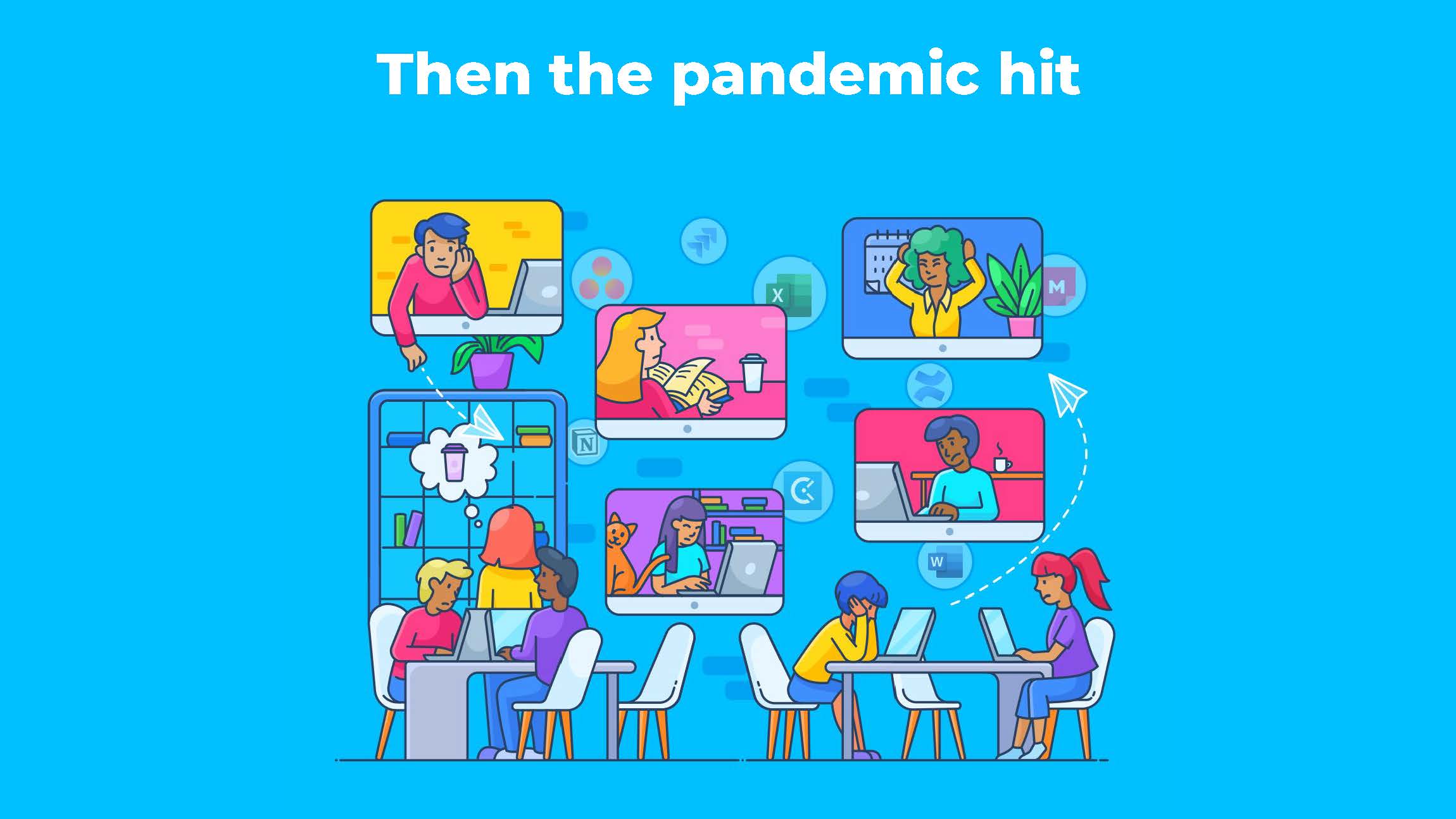
Finally, we get to the “Then the pandemic hit” illustration depicting a scenario everyone in the knowledge industry can relate to. Instead of the workers collaborating in the same space, many participate remotely and can only interact by means of a screen. The apps now hover in the background, faded and ephemeral as part of the ether. Folks are distracted: one is thinking about getting coffee, another has a cat on her desk, a third flies a (virtual? real?) airplane/ email. The hair-pulling woman is now pulling her hair at home, possibly because she has been waiting for a message from another despondent-seeming woman at the office. Clearly things have taken another turn for the worse. If only there was a solution to the workplace-woes these four illustrations so articulately and viscerally present!
After the ClickUp folks wrap up the part of their pitch deck featuring this sequence they then launch into their Marketecture (which I won’t discuss here) intended to demonstrate how their product resolves all these problems by bringing their client’s work together in one place with their core set of apps. Needless to say, ClickUp’s comic-book style form of communicating their problem statement hooked me, and although I’m an illustration nerd I know that I’m not alone in finding this visual-first mode of communication compelling.
I love stories about how the projects come together, so after this briefing I scheduled a follow-up with the ClickUp team to learn more. I was especially curious to discover how visual storytelling plays into not only their marketing and engagement strategy, but also their culture, mission, and (of course) products.
Mike Berger, VP of Product Marketing at ClickUp, gave me a little background on the design team’s process for creating this illustration sequence:
So, it’s funny, when we went through these iterations with the design team there were a couple in the stage of the story where things were really supposed to be hard, like when work was supposed to be hard to manage because of all these silos, the people look super happy. I was like, No, no, no, no. They need to look more miserable, you know? And then now they’re getting a little overwhelmed with all the different applications they have to juggle. And there’s some collaboration happening, but it’s kind of happening in pockets, right? And this is a big problem. Like, yes, there are lots of solutions out there that solve the interdepartmental collaboration piece like purpose-built platforms, but then they just solidify further these silos within an org. And then the pandemic hit and now it’s like, oh my gosh, like she’s pulling out her hair. Like he’s in misery, etc. She’s just saying, “I’m just done with work. I’m just going to read.”
For Berger and his team the long, iterative process necessary for creating illustrations was absolutely worth it to achieve an authentic connection with audiences. Moreover, these images successfully convey ClickUp’s overarching fun, energetic brand identity and values. By experiencing these visuals in a pitch deck or as part of ClickUp’s blog, I have a good sense of what it will be like to work with this company. Finally, ClickUp’s illustrations reflect the visual-first experience of the app’s slick, modern-feeling UI, as well as their supremely visual products like whiteboards.
What Do Illustrations Deliver?
I will wrap up this post with a summary of what I consider to be the advantages of using illustration as part of an excellent, multimodal communication initiative. Businesses wanting to foster authentic connections do well to think in a visual-first manner, and illustrations in particular offer means for expressing:
- Emotion: Illustrations enable viewers to feel the problem that a company is trying to solve in an embodied manner. Much as stock photos, when done well, contribute an intangible emotional response in viewers, illustrations engage viewers personally.
- Simplicity: Illustrations cut through complexity. They show connections between ideas in ways that make intuitive sense. They condense large, unwieldy ideas into digestible packages.
- Pleasure: People love pictures. Even if you’re not someone that usually devotes time to scrolling Instagram, chances are you’re willing to look at interesting pictures. Even busy and uninterested audiences are far more willing to engage with a picture than a long block of text. Both can be skimmed, but skimming an image is a pleasant experience.
- Memorable: Illustrations are sticky. They hold our attention and provide something to recall days, weeks or even years later. Consider one of today’s most memorable characters, the Geico Gecko. Few characters are more recognizable than this animated lizard. While part of this is owing to the near constant stream of commercials pitching him in front of audiences, audiences also remember the gecko because he is adorable, entertaining, and quirky. The Gecko is memorable because he lends personality and warmth to the otherwise unwelcoming and uncute insurance industry.
Disclosure: GitLab, Microsoft, and Salesforce are RedMonk clients.