“Seems like we’re having more earthquakes,” was a common refrain in the aftermath of the absolutely horrific – see the Big Picture’s heartbreaking coverage – devastation in Haiti. Coming, as it did, on the heels of last week’s California tremblor, this would seem to be a logical conclusion.
But is it correct?
To try and answer that sad question, I began with data from the USGS, which someone (I can’t find a pointer anymore, ping me if you know who’s responsible) had thoughtfully dropped into a Google Doc. Because the dataset only includes events where the casualties were greater than 1,000, our answer will be imperfect, but it’s a start.
Because it can be difficult to extract patterns from raw data, I thought it would be useful to try and visualize it. While I could have used online tools such as Data Applied or GoodData for the purpose (not to mention these options covered by Flowing Data or full fledged BI tools like Cognos), on the recommendation of Infochimp’s Flip Kromer I gave Tableau a try. In spite of the fact that, having no Linux client, I had to spin up a Windows instance to use it.
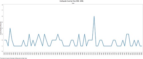
Here’s what Tableau had to say about the earthquake frequency. Or, more accurately, the frequency of particularly deadly earthquakes.

There’s no apparent pattern at work, from what I can tell. Apparent from the spike in the mid-70’s, the frequency of deadly earthquakes seems to be roughly static.
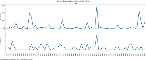
But what about the casualty rate? Or the magnitude? Are either varying according to time?

Not perceptibly. As you can see, there’s a rough correlation between magnitude and the death toll, but there is no clearly identifiable escalation trend in either severity or cost of life. Here’s a different way of looking at the costs over time.
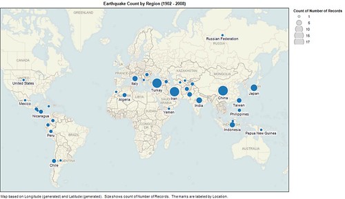
Which is not to say there are not observable patterns in the data. There are, for example, obvious geographic correlations. The frequency of deadly earthquakes, for example, appears to vary significantly by geography.
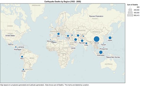
Which explains, in part, the geographic plotting of lives lost.
Obviously, there is more at work than geography. Socioeconomics have bearing on the availability and quality of medical care, for example, which in turn directly impacts the human implications of natural diasters, be they earthquake or other in nature. It’s also true that this doesn’t truly answer the questions, because we’re working on a subset of the earthquake data, which means that we’re answering a materially different question in most cases.
But the above exercise is just one example of how we can question and challenge our intuition by using data; by leveraging it in forms that make patterns and anomalies more readily identifiable.
None of the above will help the people of Haiti, sadly. For that please text Haiti to 90999 to donate $10 to the Red Cross; we’ve raised $8 million that way already. It’s also possible that the data from 2008 on will, in fact, demonstrate a troubling pattern of increased event frequency and devastation.
Until then, however, we should all try to remember to question what we think we know, because as a species we tend to be unduly influenced by recent events – particularly those that are frightening. Which is something we might want to keep firmly in mind, particularly these days.


