During a recent podcast appearance with Senors Asay, Rosenberg, and Vance, Canonical’s Mark Shuttleworth discussed the 3D desktop capabilities offered in the latest iteration of Ubuntu, Gutsy Gibbon. Given that I’ve been using Gutsy for a few months, and using said 3D functionality off and on I had a special interest in his comments. Among other things, he expressed his hope that the various communities that provide and consume the functionality would seek ways to apply the new capabilities to the task of making the user more productive.
A month ago, I would have wholeheartedly agreed. And in fact, I still do, for the most part. But my recent usage has led me to question my original belief that these technologies – while visually impressive – were largely gratuitous and trivial in their current incarnation.
I’ve been a fan of the 3D desktop for quite some time now. At one point, on a plane to a conference, I turned my entire desktop into a series of very small blue cubes. Barely recovered from that one. Still later, I corrupted the very hard drive I’m writing this from by getting a bit overambitious in some experimentation. And yet, I was interested enough that I still kept trying to get the technologies up and running.
Once successful, however, the initial elation quickly faded. While having transition animations like OS X and transparent borders and so on is a definite improvement over the usual staid desktop experience, it did little to make me more productive. Indeed, some of the effects were little more than a distraction (the one that burns up closed windows, in particular).
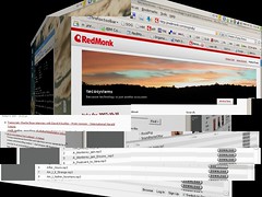
But over the past few weeks, I’ve taken to using the multiple desktop concept quite heavily. This capability has been present in the desktop for years now, but the Compiz-fusion enabled 3D functionality in Ubuntu made them really usable to me for the first time by – get this – turning my desktop into a cube (forgive the poor image, the screenshot app got a bit overwhelmed).
These days, I typically assign one side of the cube (a desktop, in other words) to a browser, IM, IRC and other related tasks, one to writing, one to Songbird, and the last to my terminal windows and other miscellaneous tasks. Navigation between them is a simple CTL-SHIFT-ARROW sequence. How is this faster than a simple ALT-TAB? Well, when you’re working with as many windows as I tend to be, sequencing through them can be tedious. OS X users are probably sitting their smugly saying, “Well, you just wish you had something like Expose.” As it turns out, we do – the 3D desktop includes a plugin called Scale that replicates the Expose functionality fairly effectively. But still, there are a lot of apps to pick through. It’s nice, instead, to work on a small set of related windows in a desktop dedicated to that purpose.
My experience, of course, is but a single datapoint. More pertinently, average users can hardly be expected to see the benefit to adapting to such a radical change in the UI paradigm. But each time I use the 3D desktop, I become convinced that users will have to meet the technology half way: the latter can certainly be more polished and user friendly, but consumers of the technology may have to be willing to think outside the traditional desktop, as it were.

