One of the things you’ll hear people say of open source from time to time is that it’s incapable of innovation. Pointing to applications that mirror existing products such as Microsoft Word, they’ll make the argument that innovation is still in large part the province of commercial, proprietary development processes.
I, for one, don’t buy that. In my experience open source is no more or less intrinsically innovative than the alternative; it is merely a different means of developing software. True, the most popular open source projects are in established areas – operating systems, databases, web servers, etc – but that seems to me to be more a reflection of customer needs than anything else.
One of the reasons that I believe open source can be innovative is the people – people like Alex Graveley. I don’t know Alex personally, but I’ve used his Tomboy software for some time now [1]. Tomboy is at once innovative and derivative; in demonstrating it to people, they are initially unimpressed, thinking it’s just another sticky notes application. But Tomboy, in my view, is considerably more than just another sticky notes application; it’s sticky notes, blended with wiki technology, crossed with just a bit of OneNote. All in all, an interesting combination.
When Alex announced his new project Gimmie a while back, I was intrigued. Intrigued because the desktop, IMO, still has lots of room for innovation. The basic means of communicating with our desktops, after all, has evolved very little over the past decade. Menu, point, click, save, toggle, etc. Gimmie didn’t solve all of the problems here, but did represent some fresh thinking on an old problem.
I had a bit of difficulty getting it installed due to some of the dependencies, but was successful over the long weekend. For the past day or so I’ve been running with Gimmie as a replacement for my lower panel. To fully embrace the Gimmie way of doing things, I should remove the traditional Gnome application menus from my upper panel, but I’m not ready to go there yet.
As promised, Gimmie is an elegant riff on the existing application panel – one with considerably greater intelligence than is typical. It recognizes, for examples, people related tasks as distinct from those, say, of document authoring. It groups your applications according to what’s frequently used – much as Windows XP does in its revamped Start Menu. But more importantly, it integrates the things I typically do – IM, document authoring, browsing, search, etc – into a single, easily accessible menu.
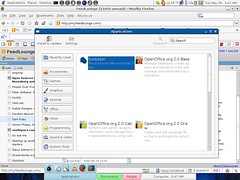
Is Gimmie for me, then? Is it a replacement for the way that I’ve typically done things via Gnome, or Windows previously? It’s too early to say, but I suspect not. The main reason is simple; Gimmie, like OS X’s dock, is heavily mouse dependent, and I try to use the mouse less rather than more. Hovering over the applications block reveals the open applications, as in the inset picture, but I don’t enjoy using the mouse that much.
But even should Gimmie not prove to be the appropriate desktop mechanism for me, I applaud both its design goals and its ability to rethink desktop design elements that have become stagnant. Those of you who are a.) on Linux and b.) mouse fans may well find it to be a dramatic improvement on your current desktop metaphor, and all of that in a few thousand lines of Python code. Kudos to Alex for reminding us that innovation is reflective of the developer, not the development model.
[1] Despite my adoption of TiddlyWiki at Tomboy’s expense, it hasn’t gone away – and the former is starting to show scaling issues. Tomboy may yet make a comeback, despite its ravenouse appetite for memory and CPU cycles at startup.

