When first embarking on the job hunt towards the tail end of my college career, I was fortunate enough to be given the opportunity to take a set of career aptitude type exams. You might know them; these are the tests where you answer fifty questions and they return an eerily accurate impression of your personality. Some of the results, of course, were more illuminating than others, but much of the quasi-psycho analysis merely confirmed things that I already knew. For example, it informed me politely that I possess the design sense of a blind monkey. And following this conversation with Alex, I was once more reminded of this unavoidable truth.
On the way back from Mashup Camp, he took the time to show me TextMate, a basic coding oriented text editor that I was vaguely familiar with but had never used (not least b/c I don’t have an OS X environment). It’s dramatically less ambitious than the full blown IDEs we’re used to covering, and yet is the editor of choice for every Rails core contributor. Clearly, something was up. Besides some very friendly syntax highlighting and occasionally nifty code completion, however, I didn’t see a ton to differentiate the product from a number of other editors. Except for the aesthetics, that is.
TextMate, in my limited experience, is a very pretty application. That may seem trivial in the context of discussions of “enterprise features” and so on, but the fact of the matter is that if you’re going to be spending a lot of time in an environment, it’s better if it looks nice (one reason why I just spiffed up my Gnome install). Go figure.
But more important than the fact that it looks nice to start is that it appreciates the simple truth that beauty is in the eye of the beholder. It supports, as I believe all editors should, user selectable themes that allow for coordinated color schemes. To its credit, it also goes one step further and permits users to design and share themes with each other (why more applications don’t do this is beyond me, buy I digress). Alex, for example, runs a theme that involves white and colored text against a black background; one which I found rather alien at first, but came to appreciate after trying to read it for a couple of minutes.
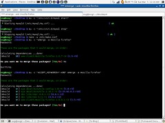
I appreciated it so much, in fact, that when I returned to my machine I made every effort to replicate this theme in the tools at my disposal: the Gnome terminal (pictured: select “white on black” as the default theme in the colors tab), Gedit, and Eclipse. Unfortunately, with the notable exception of Gnome terminal, most of my appliations made altering the default colors and fonts hideously difficult (here are the instructions for Eclipse – ugh). Instead of letting me pick a new theme that’s been prechosen for me, I’m forced to select colors and fonts on a far more granular basis. As if changes to one selection don’t affect another.
Unfortunately for me, that’s not the case: as soon as I’m presented with the option to begin picking colors individually, I give up, because, well, we all know what my design sense is like. Odds are running at close to 100% that I’ll wind up with an editor worse looking than the one I started with. Hence the importance of themes, which allow those more skilled in the visual arts than I to preselect a set of colors that work well together for me.
But why is this all important? It’s just a bunch of colors, right? Well, tell that to the folks using OS X. Just trust me on this – when it comes to developers, pretty is a feature.

